
Nari
A sense of belonging, by design.

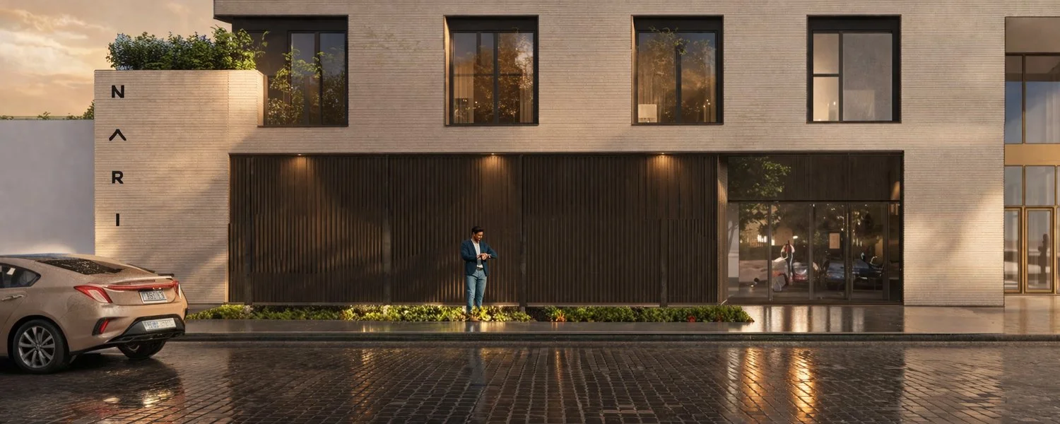
Nari is an urban residential project built around community, connection, and a well-lived life. We created a visual identity that brings that vision into focus, connecting the character of the architecture with a calm, welcoming approach to everyday living.

From the wordmark to printed materials and digital design, the identity gives Nari a consistent way to introduce the place and the life it imagines.

Services

Brand Identity • Creative Direction • Digital • Art Direction

Industry

Residential Real Estate


The Challenge.

Giving a place its own character.

Nari’s vision brings people of different generations together through a shared sense of community. The identity needed to communicate that ambition while establishing a clear connection to the building itself.

The challenge was to balance architectural precision with a feeling of warmth. It needed to feel considered and contemporary, while remaining open, approachable, and relevant to the people who might call Nari home.

A stylized logo featuring a green checkmark with a black background.

The Idea.

A well-lived life starts with connection.

The brief drew on Blue Zones, ikigai, and the Zen ensō as starting points for exploring connection, purpose, and continuity.

We brought those references into a focused visual direction: a balance of structure and openness.

Architectural forms give the identity its foundation, while generous space, natural colour, and imagery bring a quieter, more human quality to the communication.

The wordmark connects two architectural references: the angular geometry of the building and the sloping rooflines found in traditional Korean and Japanese architecture.

These influences come together most clearly in the distinctive “A.” Its open, roof-like form gives the name a recognizable centre and a direct relationship to the idea of home.

Balanced spacing gives each letter room to breathe. Together, the letterforms create a measured rhythm that reflects the calm and harmony at the heart of the project.

A stylized logo featuring a green checkmark with a black background.

Logo Development.

From roofline to letterform.
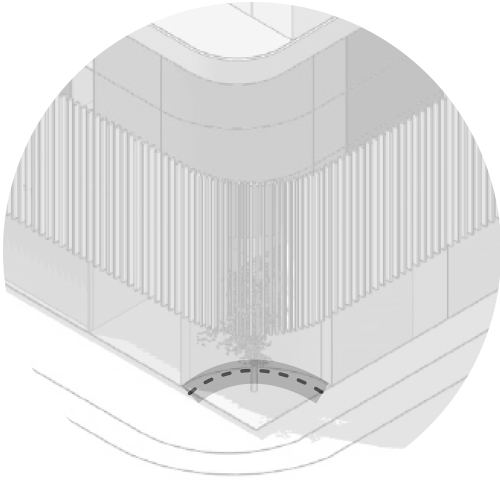
Building Design Element

Japanese & Korean
Traditional Roofs Angles

↓

The Identity.

Simple ingredients.
Plenty of personality.

The identity is intentionally direct.

A bold typographic system creates recognition quickly, while illustration gives the brand its more expressive, human character.

The graphic elements were developed as a flexible toolkit rather than isolated assets, allowing SDC to combine typography, colour, imagery, and illustration differently depending on the application while still feeling unmistakably like the same brand.

Typography

Bold enough to be noticed.

Typography plays a central role in the identity, giving headlines, menus, promotional pieces, and social content a strong visual voice even when imagery isn't present.

Colour

Warm, energetic, recognizable.

Colour differentiates products within the range while maintaining a clear relationship to the master brand.

The palette supports fast identification between flavours and creates a consistent structure across multiple SKUs.

Illustration

A little character goes a long way.

Illustration adds warmth and personality to the system, giving SDC a recognizable visual language that can move between communications, merchandise, signage, campaigns, and digital content.

A stylized logo featuring a green checkmark with a black background.

Brand System.

Built to move.

SDC needed an identity capable of moving between digital content, printed materials, menus, event environments, promotional pieces, and everyday communications without becoming repetitive.

Rather than creating one fixed composition, we developed a set of visual ingredients that can be combined and adapted while keeping the brand consistent.

This gives SDC enough structure to remain recognizable — and enough freedom to stay fresh
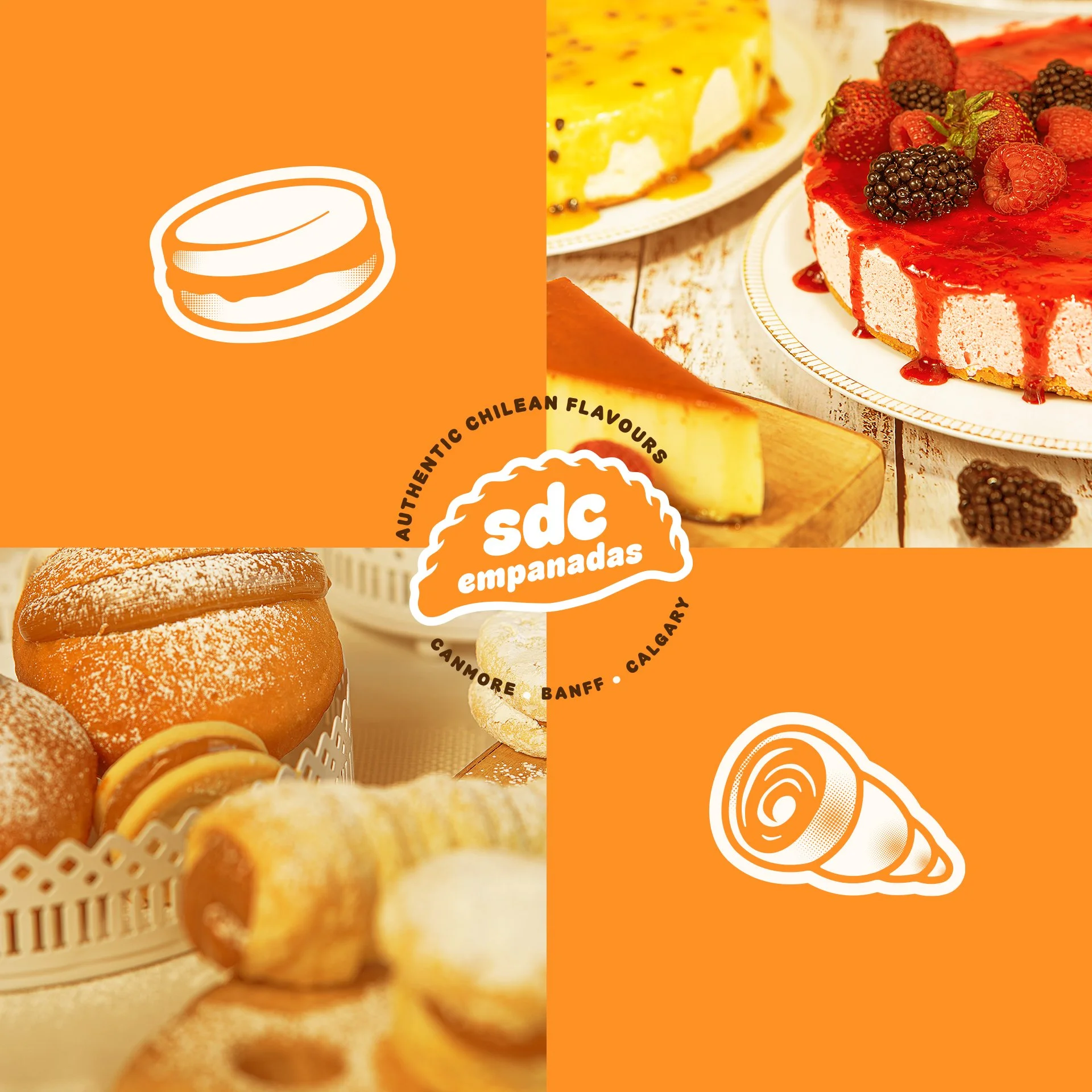
Image of assorted desserts including a cheesecake topped with berries, a panna cotta with caramel, and a basket of profiteroles dusted with powdered sugar.
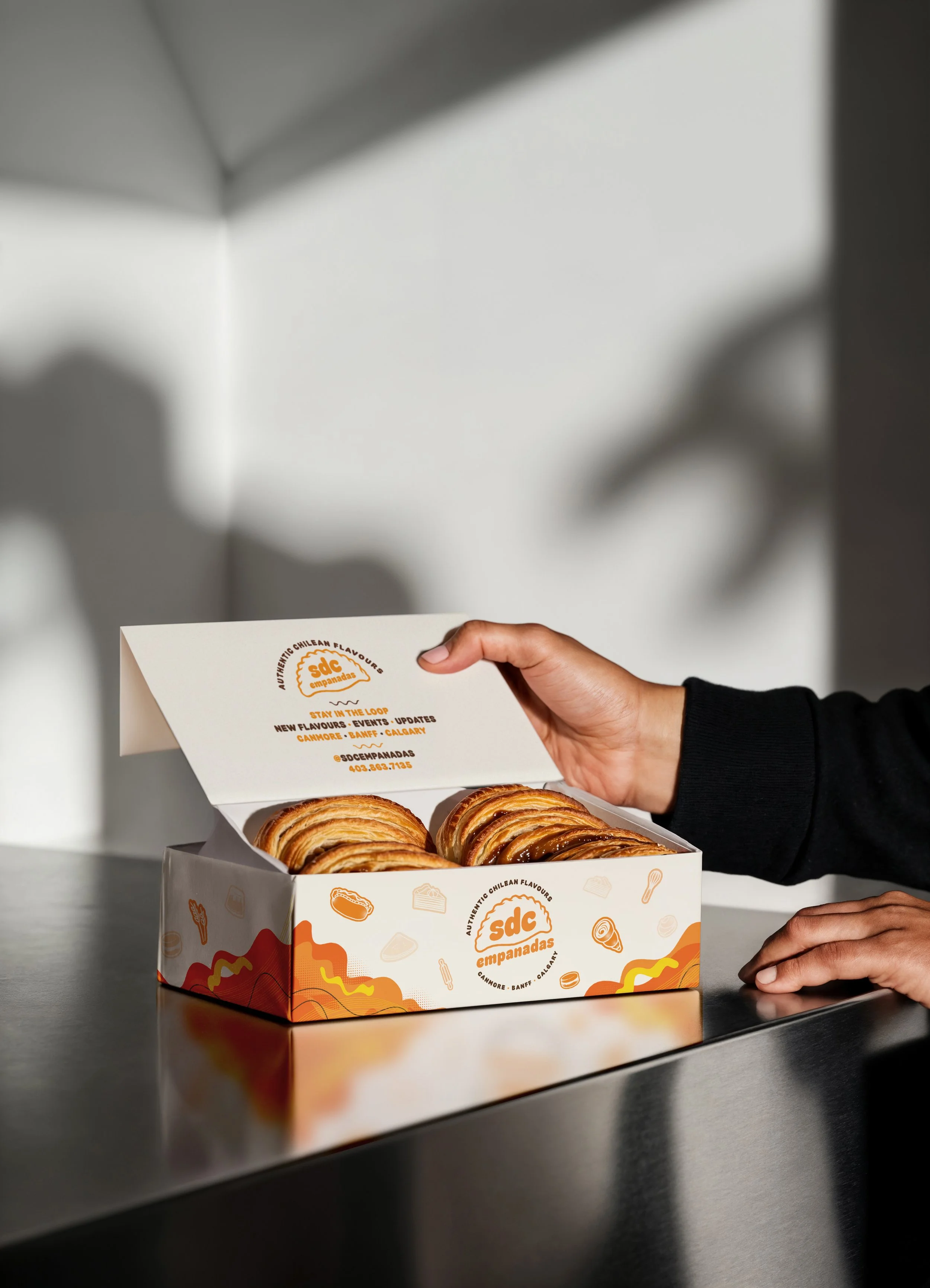
A person opening a box of empanadas with the logo 'SDC Empanadas' on the inside lid, featuring a hand with dark skin and black sleeve. The empanadas are golden brown and placed inside the box on a reflective metallic surface, with a blurred gray background and shadows.
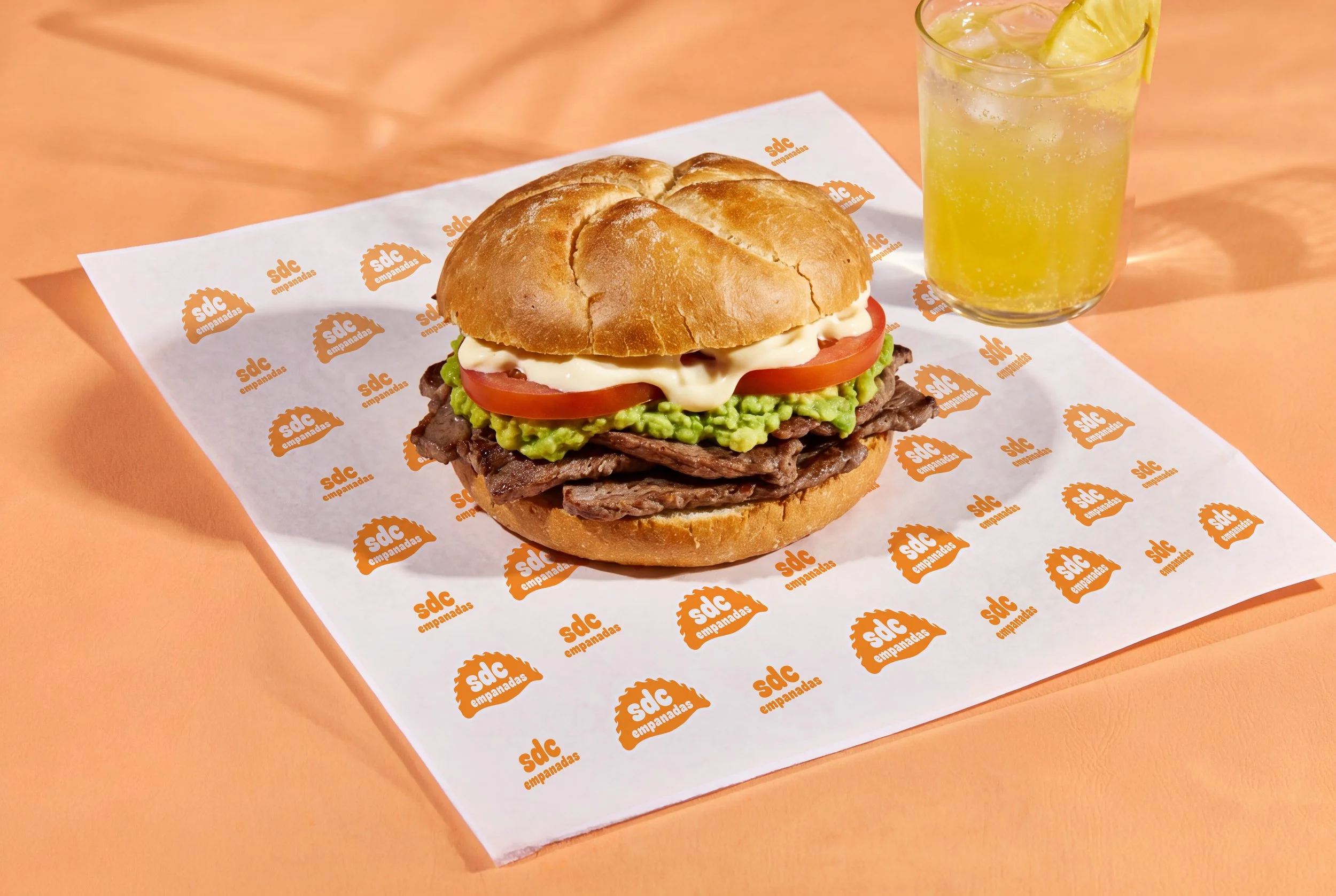
A sandwich with beef, palta, tomato, mayonnaise, and a sandwich bun on branded paper, next to a glass of lemon soda with ice.
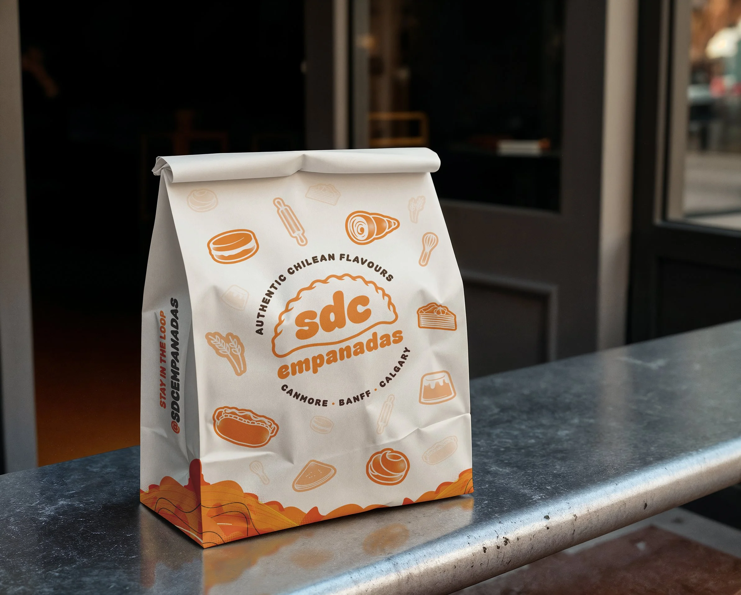
A white paper bag with orange illustrations and black text, sitting on a dark countertop near a window, with a blurred background.
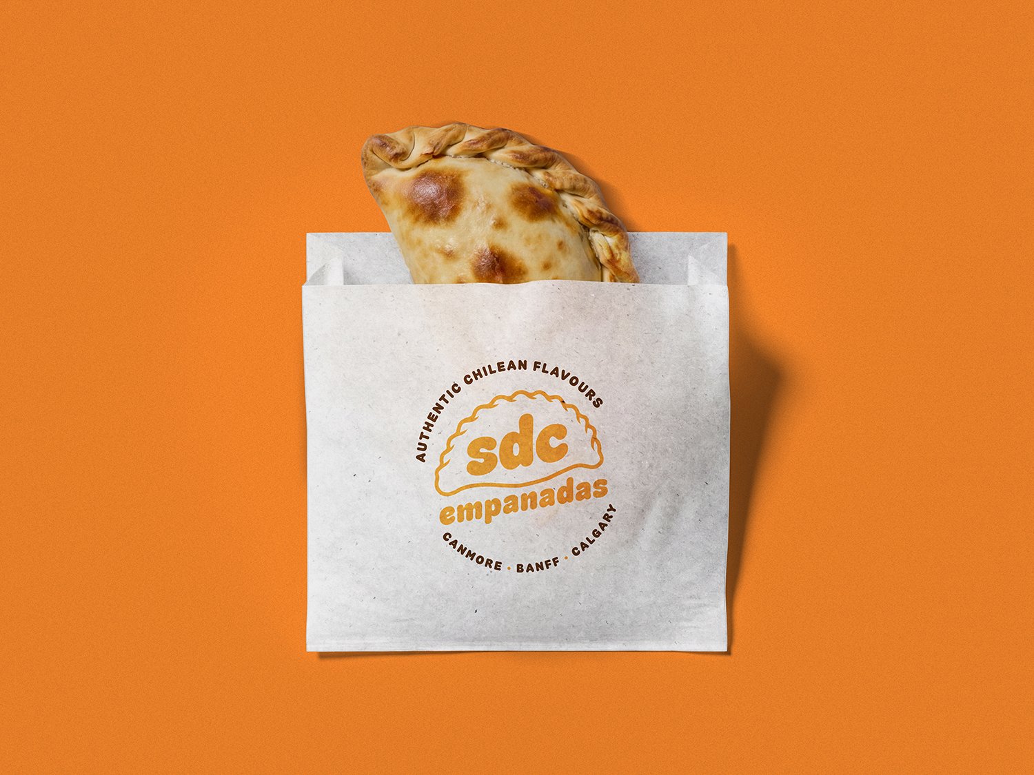
A white paper bag with a logo reading 'sdc empanadas' and the text 'Authentic Chilean Flavours, Canmore, Banff, Calgary' printed on it. An empanada with a golden-brown crust and crimped edge is sticking out of the bag, set against an orange background.

Sweet Pastries

Creamy & Powdered

Baked goods

Original seasonings

Fried & Crispy

Dulce de Leche

Butter

In the Real World.

Made for wherever the food goes.

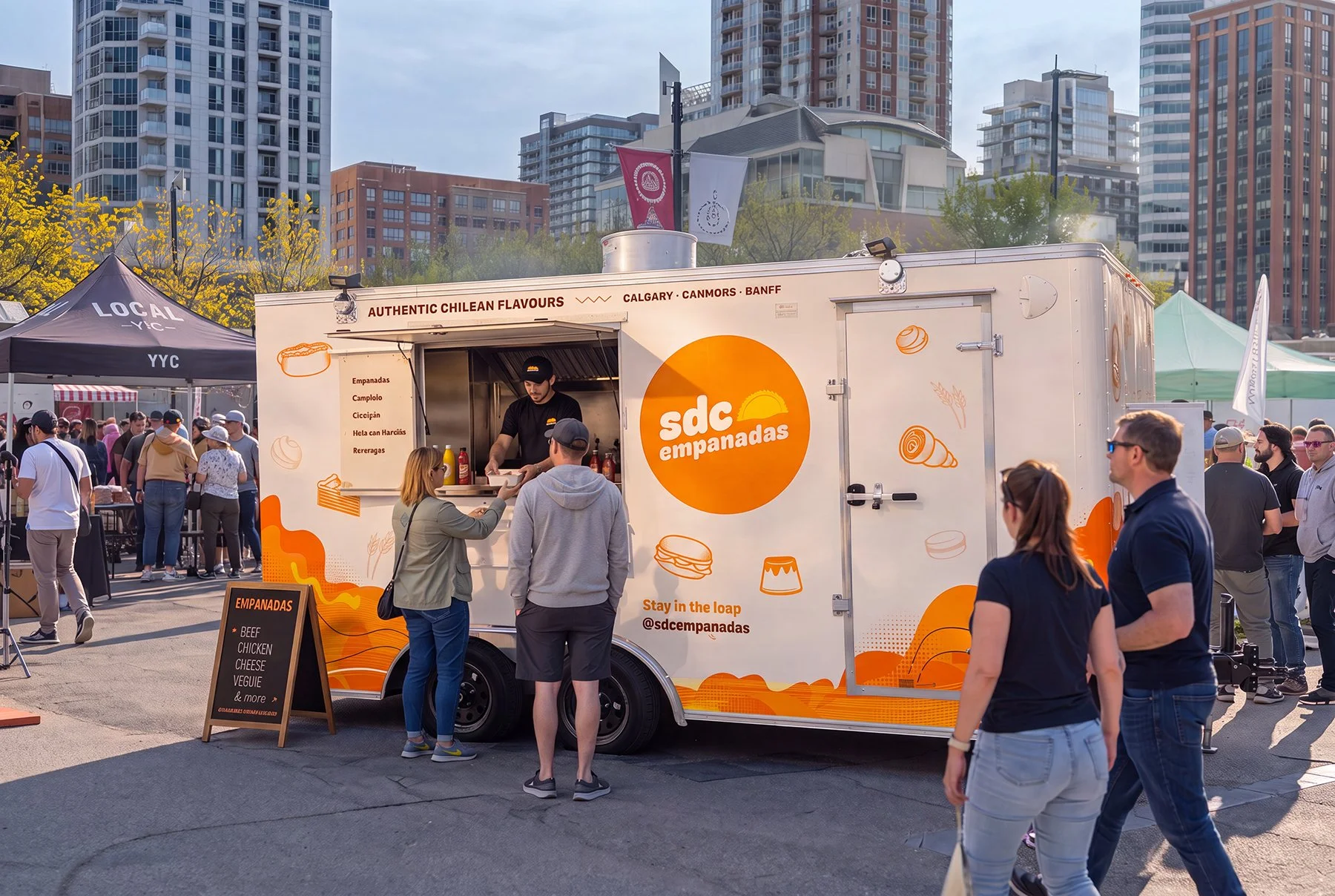
The identity was applied across the touchpoints SDC uses to meet people — from digital communication and promotional materials to markets and physical brand experiences.

The goal was always the same: make the brand easy to recognize and enjoyable to interact with, wherever someone encounters it.

Applications

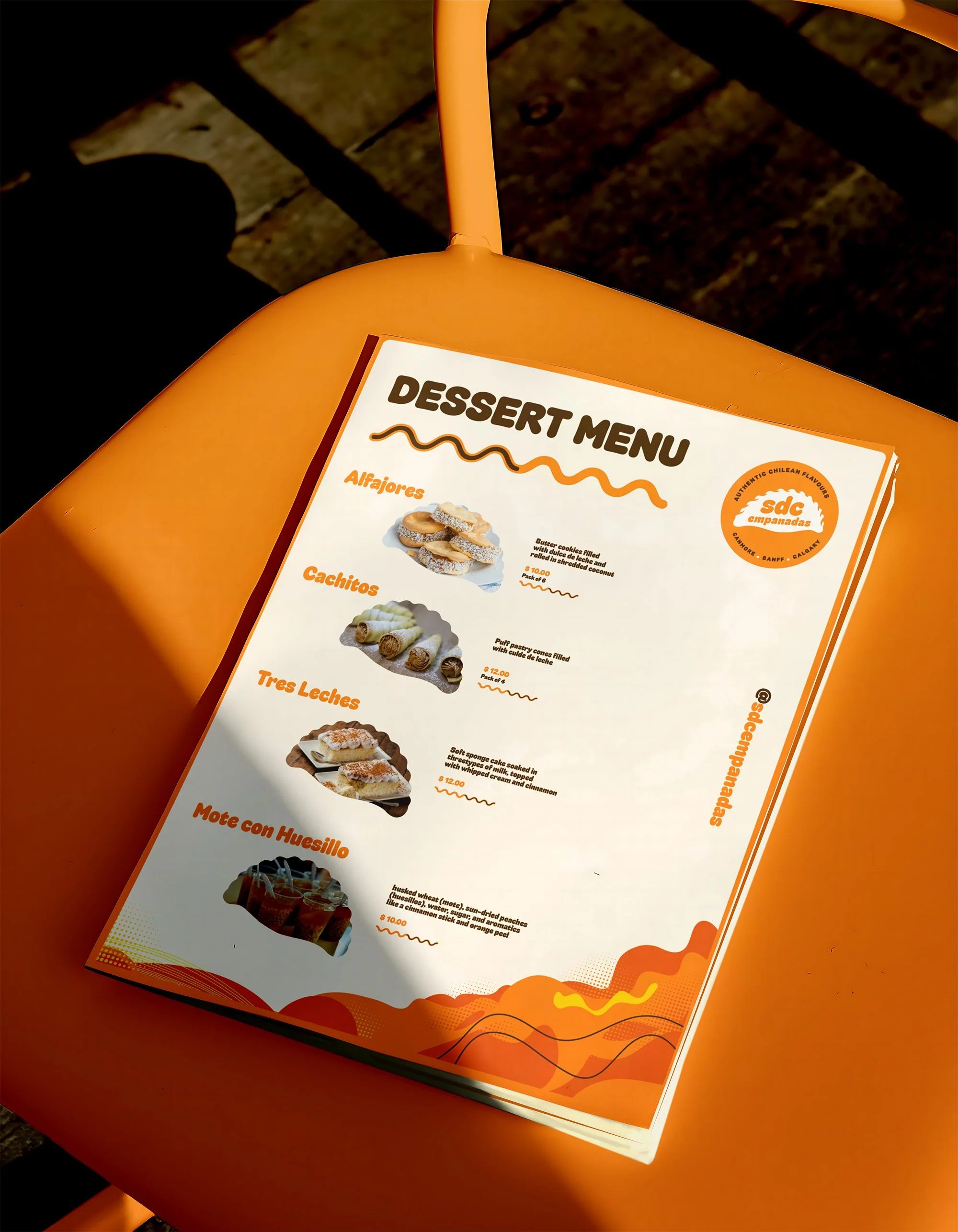
Menus

Clear information hierarchy without losing the personality of the brand.

Social & Digital

A flexible content system designed to make everyday communication feel consistent without every post looking identical.

Events & Markets

Graphic elements that can work quickly and clearly in environments where customers are seeing multiple vendors at once.

Promotional Materials

Campaign and print applications that extend the visual language beyond the core identity.
A stylized logo featuring a green checkmark with a black background.
Close-up of a dessert menu on an orange table, featuring images and descriptions of Colombian-style desserts like alfajores, cachitos, tres leches, and mote con huesillo.
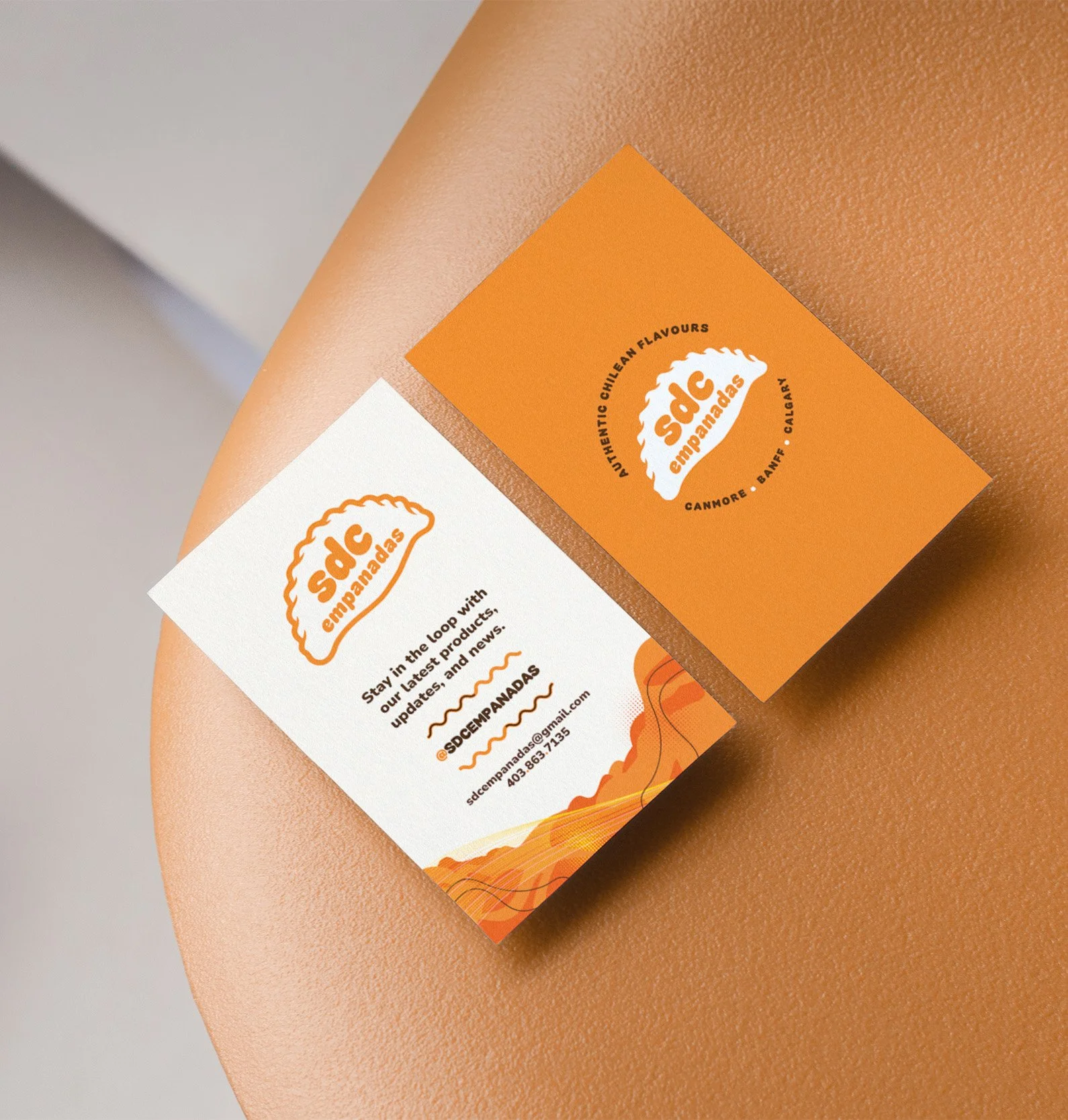
Close-up of two business cards for Sad Empanadas on a person's arm. The cards are orange and white with the company's logo and contact information.
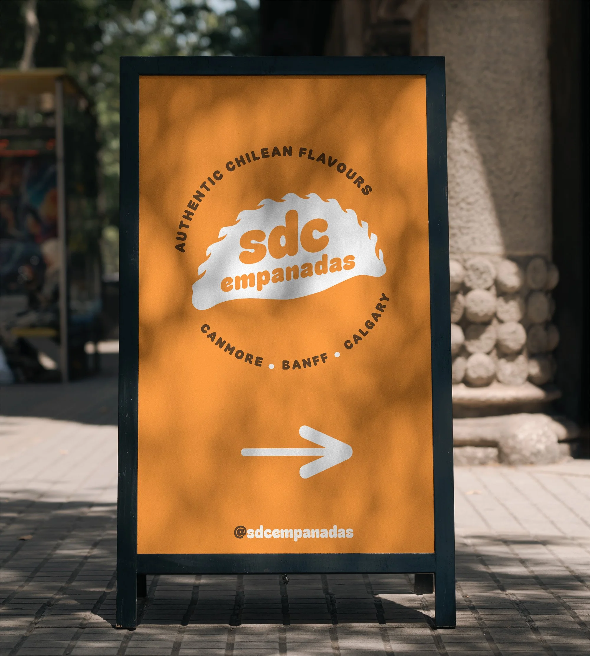
Signboard advertising empanadas with a list of Argentine regions. The text reads "Authentic Chilean Flavours," "sd empanadas," and includes the Instagram handle @sdempanadas. The signboard is outdoors on a paved area with a blurred background of trees and building structures.
A food truck named 'sdc empanadas' serving various types of empanadas at an outdoor event in a city. The truck has a sign advertising authentic Chilean flavors and a menu listing empanadas with different fillings. There are people ordering and standing nearby, with tents and tall buildings in the background.
Group of people enjoying eating pizza outdoors on a sunny day.
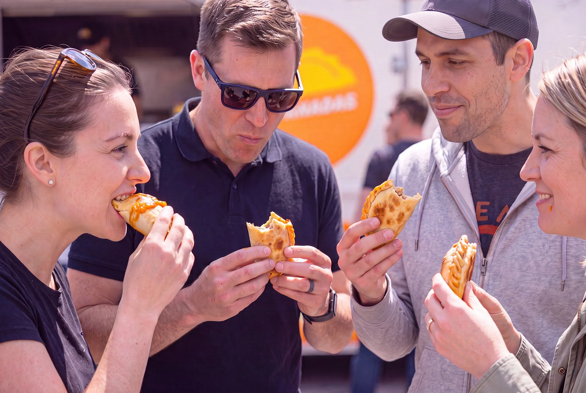
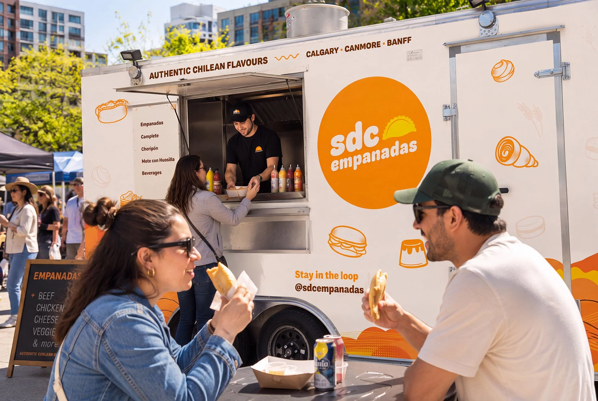
People enjoying empanadas in front of a food truck called SD Empanadas at an outdoor event, with the truck offering authentic Chilean flavors and various menu options. The scene includes a diverse group of customers eating and interacting, with the food truck decorated with orange and white graphics, and surrounded by trees and other tents.
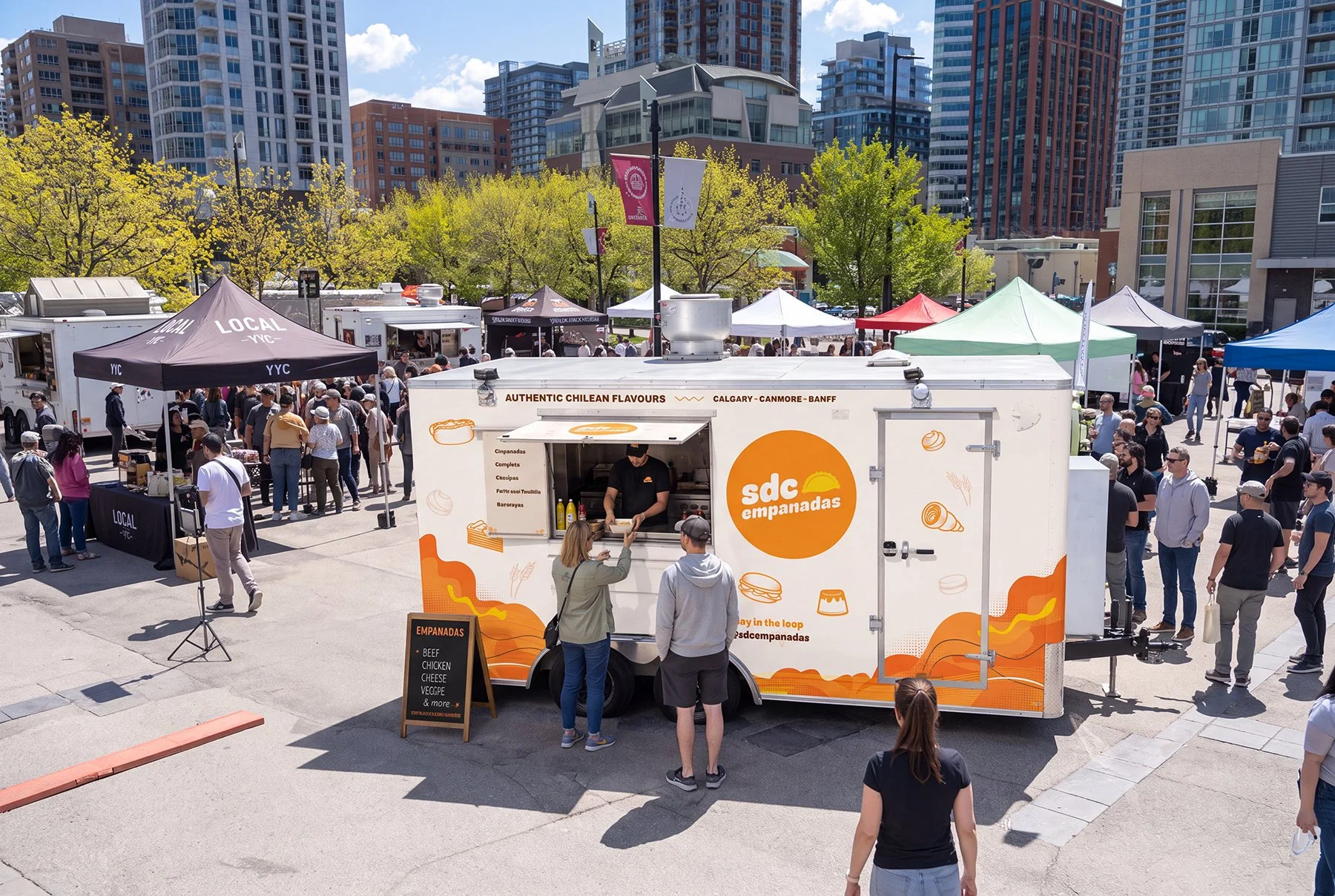
Outdoor market with food trucks and tents set up in an urban plaza surrounded by tall buildings. A food truck labeled "sdC empanadas" serves Chilean-style empanadas, and there are many people shopping and socializing.
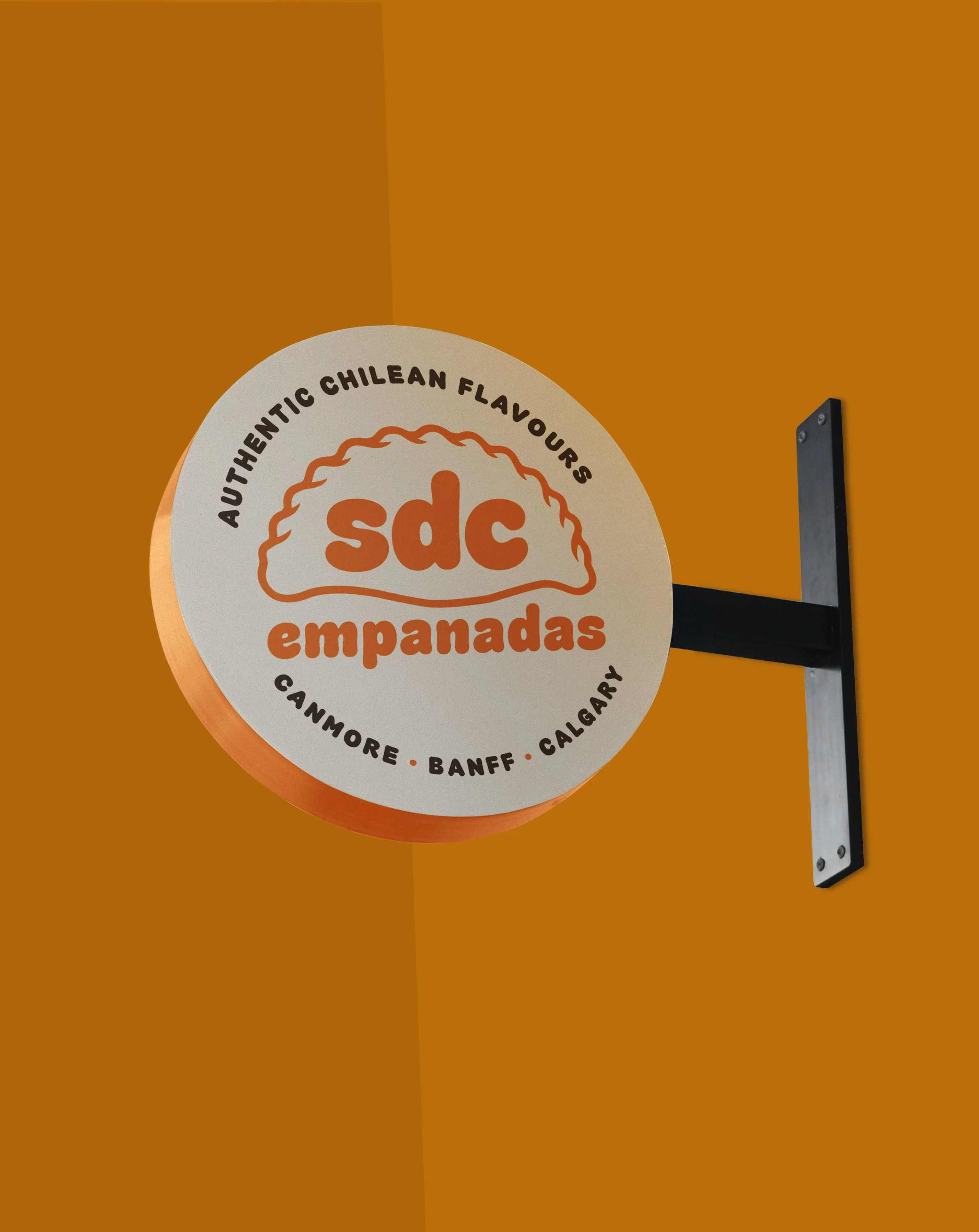
A round sign on a wall advertising empanadas with a logo and the words 'Authentic Chilean Flavours,' along with the locations 'Canmore, Banff, Calgary'.
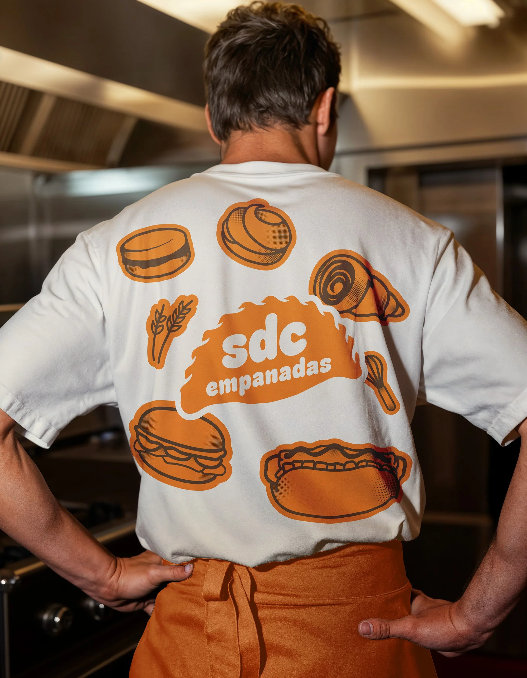
Person wearing a white t-shirt with orange food cartoon illustrations and text, standing in a kitchen. The illustrations include a burger, a chicken drumstick, and a slice of meat, along with wheat and a fork.
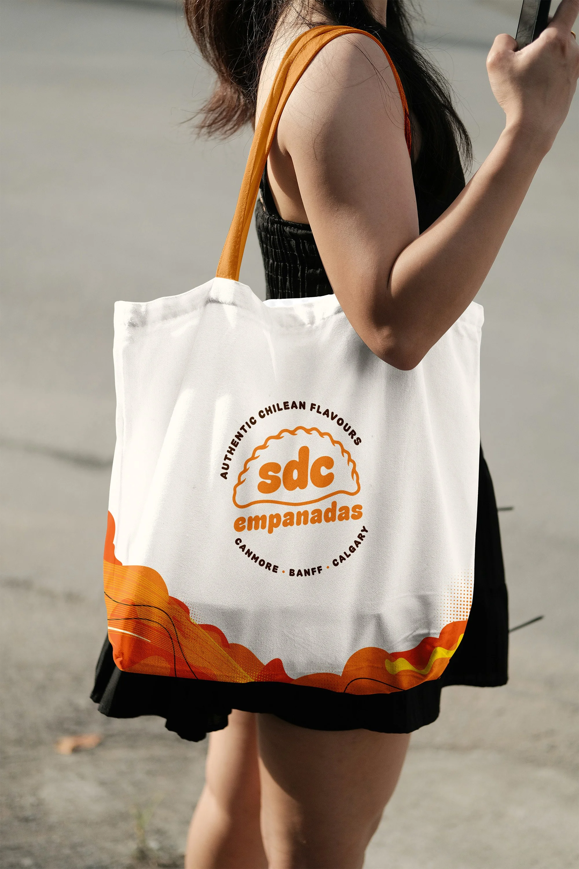
A woman wearing a black dress with orange straps, carrying a white tote bag with orange text and design, standing outdoors on a gray pavement.
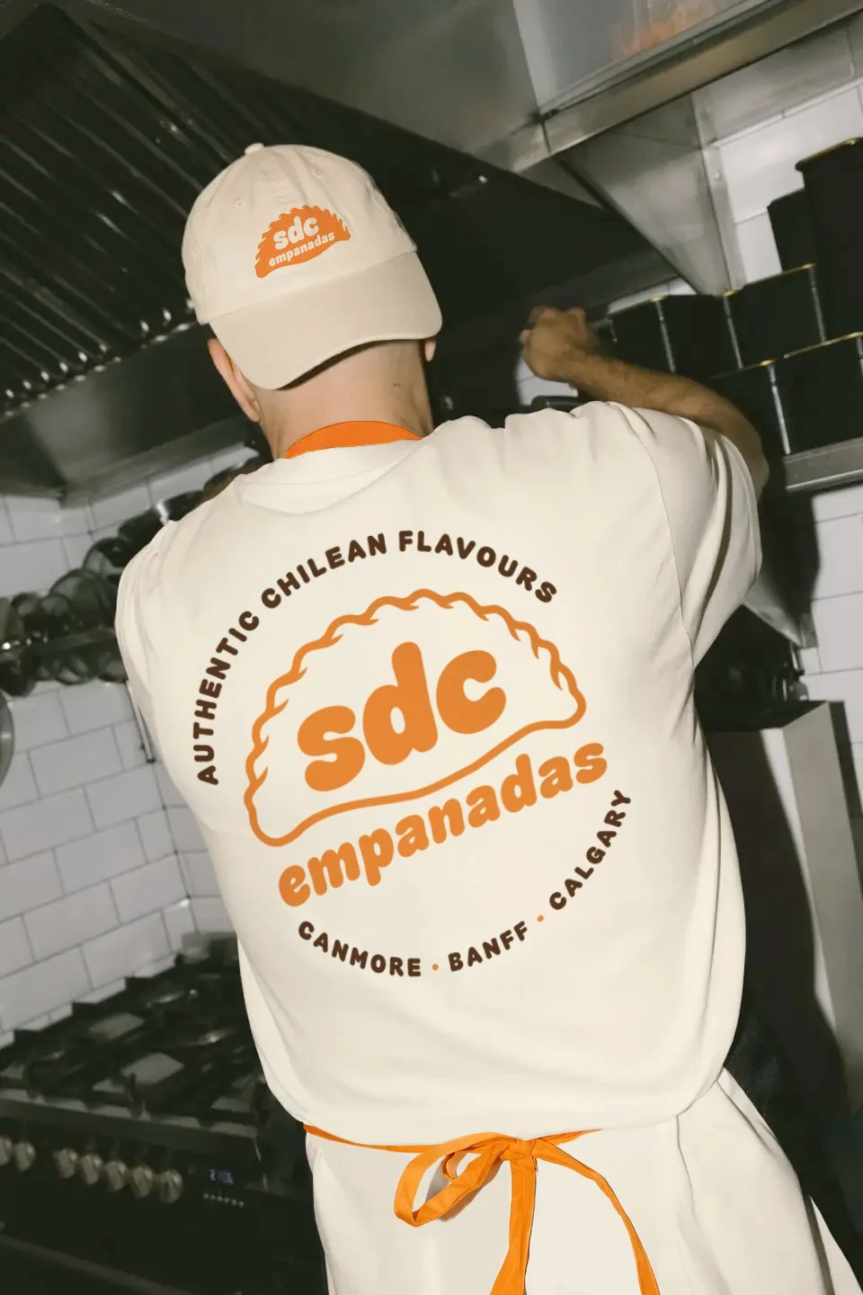
A chef wearing a beige hat and white apron with orange text prepares food in a commercial kitchen.
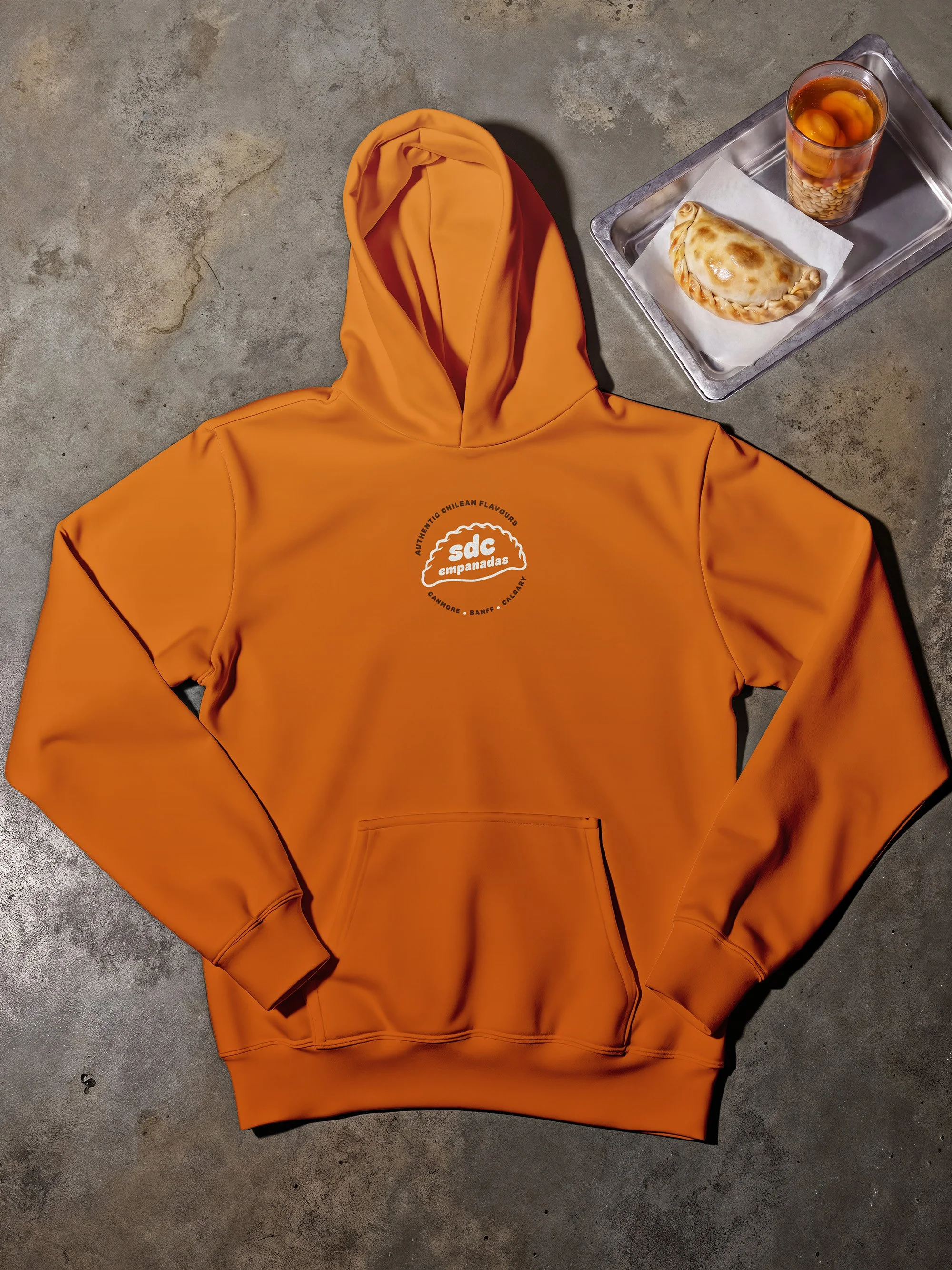
An orange hoodie with a logo on the front reading 'sdC empanadas' resting on a concrete floor next to a metal tray with a baked empanada and a glass of tea with fruit.
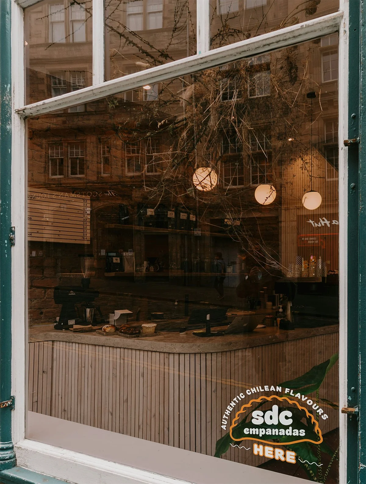
View of a bakery or cafe through a window with a sign that reads 'sdc empanadas here', showing a counter with baked goods and warm lighting inside.
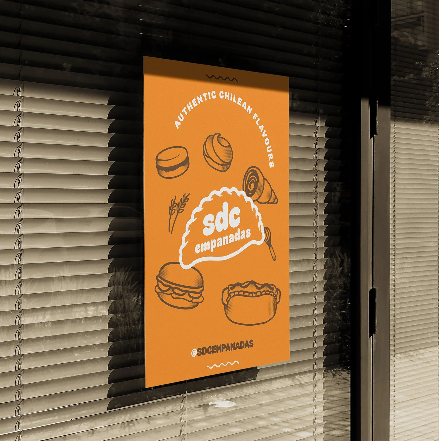
A bright orange restaurant sign advertising authentic Chilean empanadas, featuring illustrations of empanadas, bread, and a fork, with the text 'sd empanadas' and the Instagram handle '@SDCEMPANADAS'.
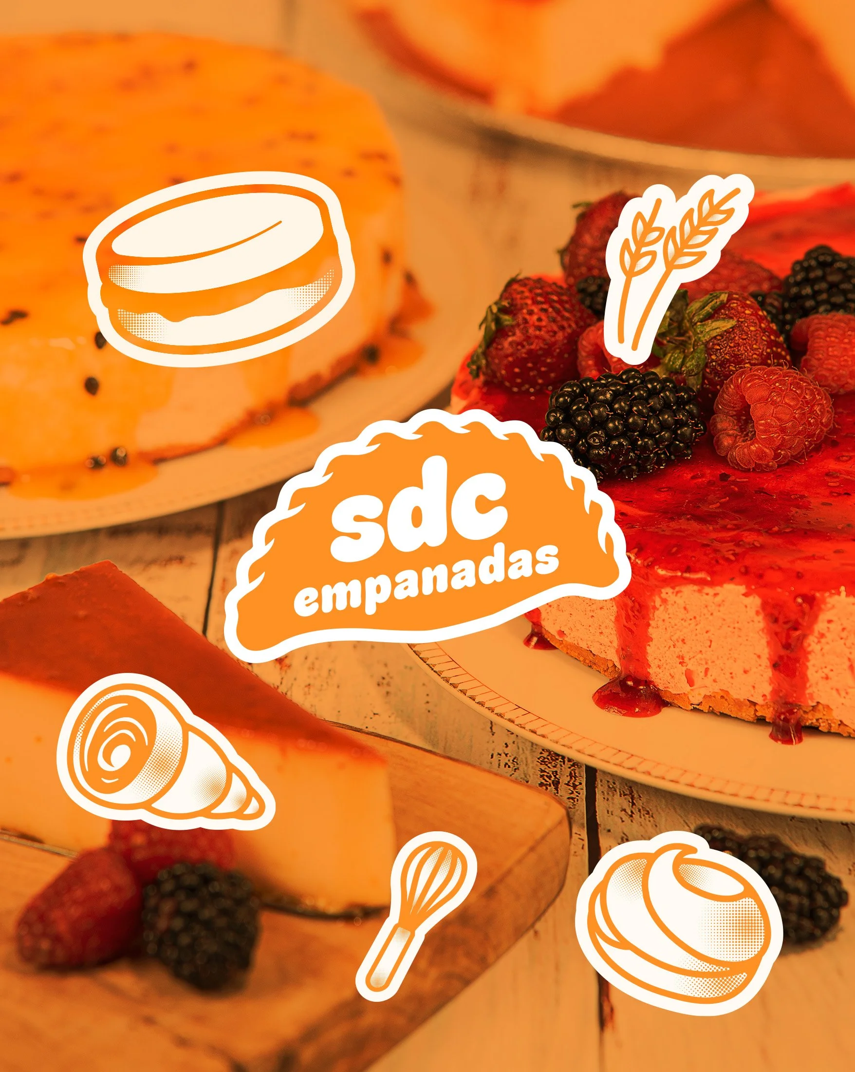
Close-up of a cheesecake topped with blackberries, strawberries, and raspberries with edible flower decorations, with some fruit and pastry illustrations overlayed.

Social / Digital

A brand designed to keep talking.

We developed digital assets and a flexible visual hierarchy that allow SDC to communicate new menu items, locations, events, and everyday content while maintaining a recognizable brand presence.

The system gives the business a repeatable foundation for creating content without requiring every communication piece to be designed from scratch.
A stylized logo featuring a green checkmark with a black background.
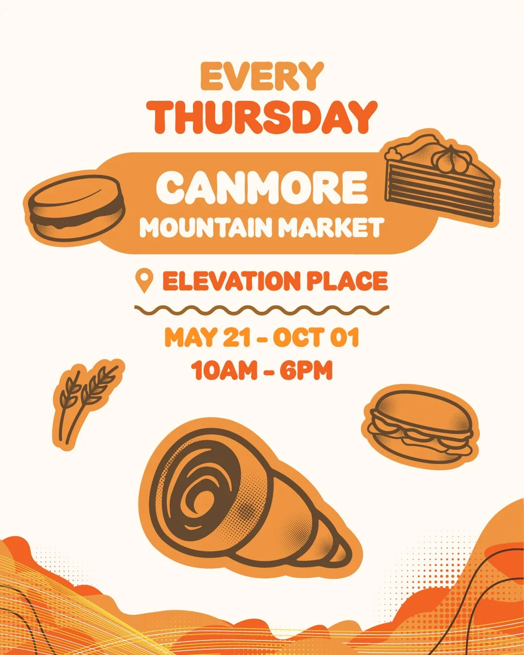
Flyer for Canmore Mountain Market, every Thursday at Elevation Place from May 21 to October 1, 10AM to 6PM, with illustrations of a burger, slice of cake, carrot, and a Swiss roll.
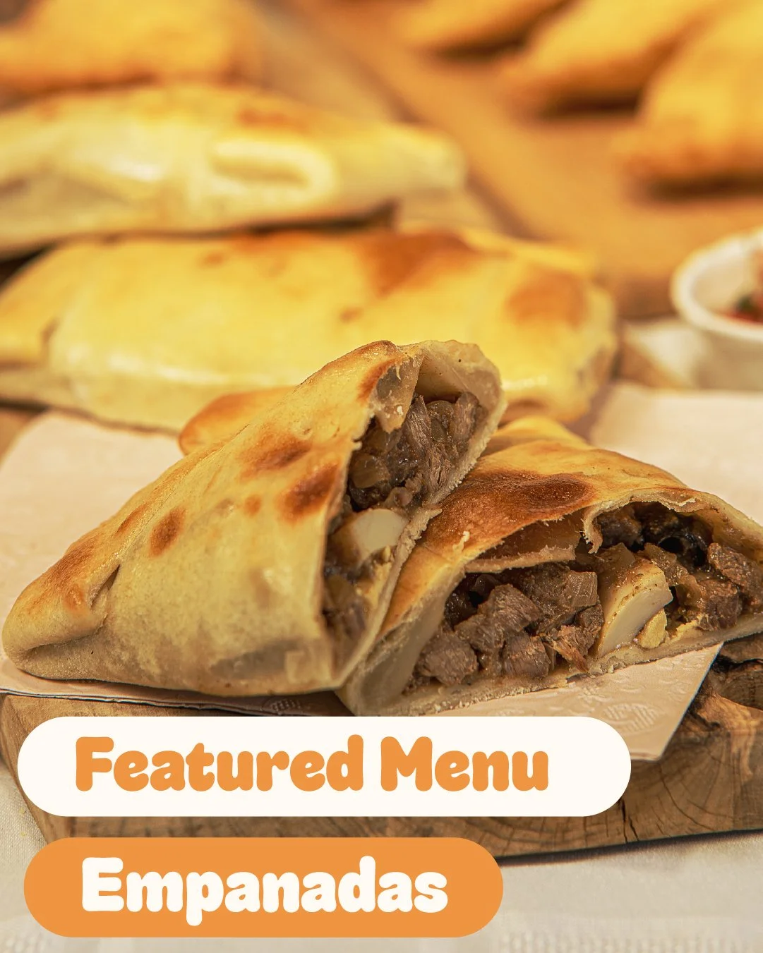
Close-up of an empanada with a crispy golden-brown crust, showing a meat and vegetable filling inside, placed on a wooden surface with additional empanadas and a small dish in the background. Text overlays reading 'Featured Menu' and 'Empanadas' in orange and white.
Flyer for every Saturday Calgary Farmers & Makers Market at SPACE, Marda Loop, from May 23 to October 17, 10am to 2pm, featuring illustrations of hot dogs, tacos, cake, and cookies.
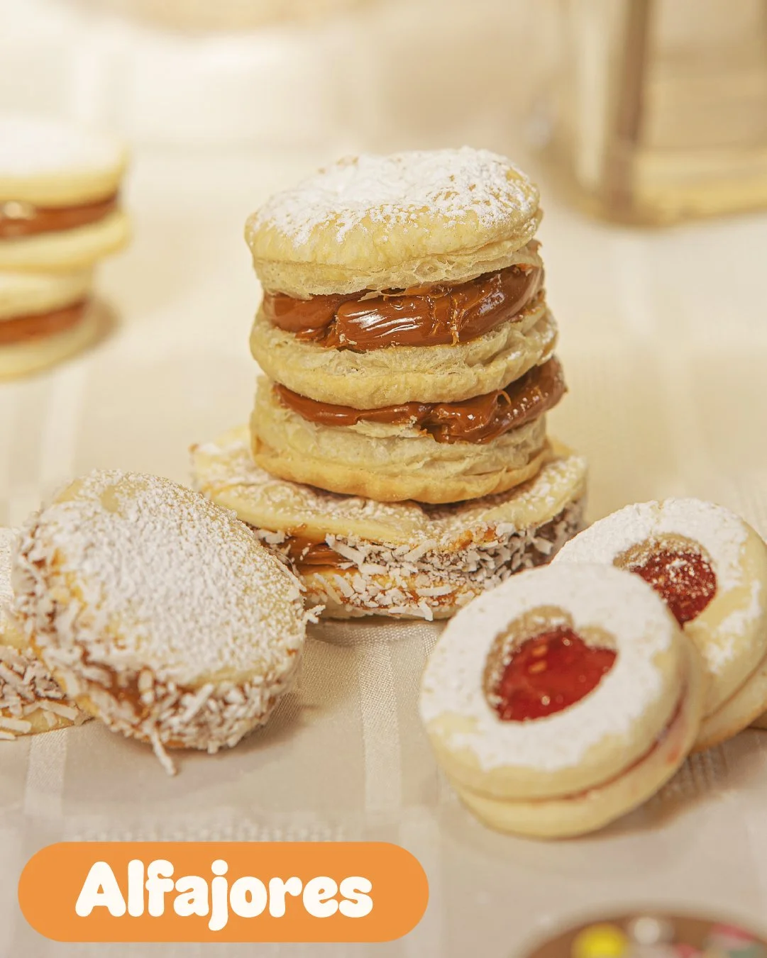
Assorted alfajores, including layered cookies with caramel filling, coconut-covered cookies with jam, and powdered sugar-covered cookies with jam notes, arranged on a table.
A logo for sdc empanadas, a Chilean empanada business, with text around it listing Calgary locations, set against a brown and orange abstract background.
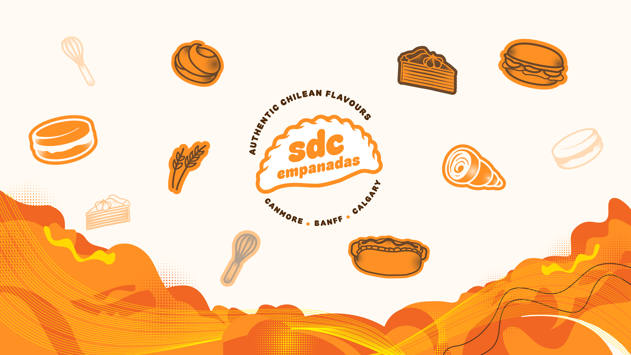
Stylized illustration of various foods including cake, pie, sandwich, burger, tortilla chips, and ingredients like wheat and a whisk, with text 'SDC empanadas' and mention of Calgary and other locations, highlighting authentic Chilean flavors.
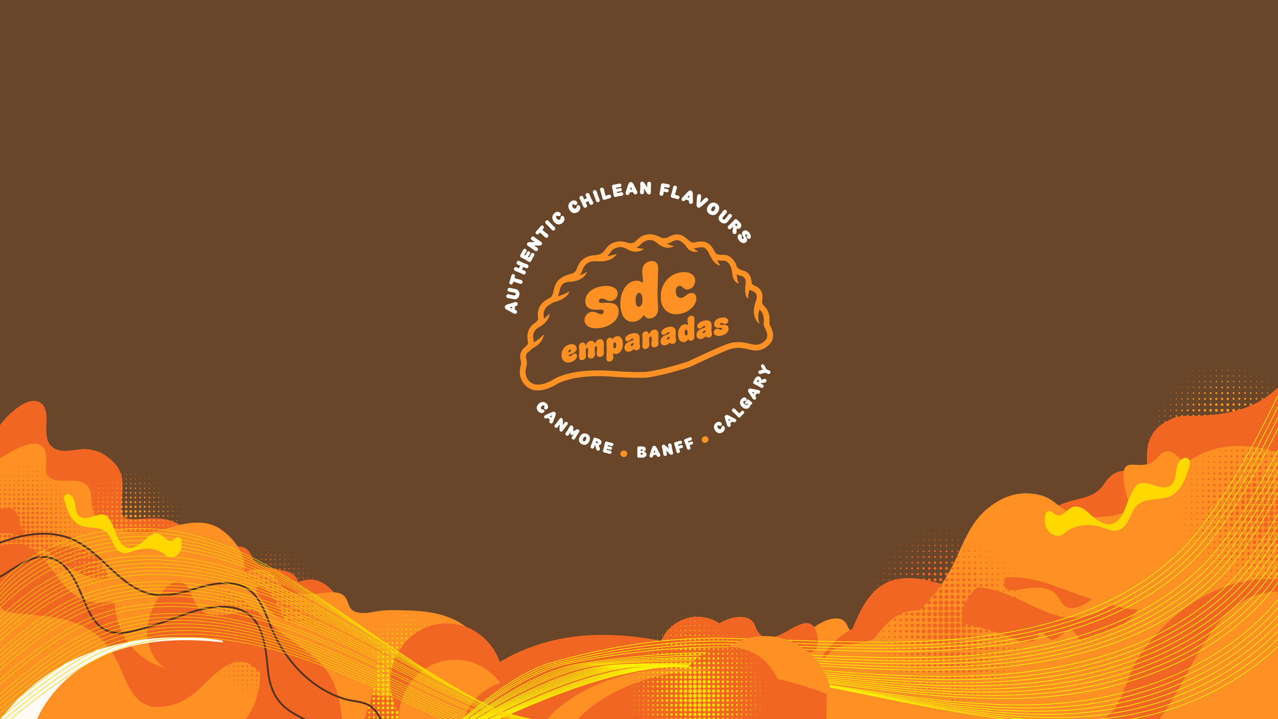
Orange background with a logo for 'sdc empanadas' in the center, surrounded by the text 'Authentic Chilean Flavours' and names of locations: Canmore, Banff, Calgary, with abstract design elements in black, yellow, and orange at the bottom.

outcome.

One identity, many places to show up.

The finished system gives SDC a recognizable visual language that can grow alongside the business.

From a food-truck appearance to a market sign or Instagram post, the brand has enough consistency to be recognized and enough flexibility to adapt.

Most importantly, the identity gives the personality behind the food a way to come through before someone has even taken their first bite.

Let’s make something worth building.

Whether you’re starting something new, evolving an existing brand, or looking for a clearer way to bring your ideas together, tell us what you’re working on and where you’d like to take it.

Next Project