
SDC Empanadas
Bringing a little piece of Chile to Alberta.
SDC Empanadas brings authentic Chilean street food to markets, events, and local communities. We created a playful, flexible identity designed to feel as warm, energetic, and approachable as the food itself.
The system brings illustration, typography, colour, and a straightforward visual language together across everything from menus and social content to physical brand touchpoints.
Services
Brand Identity • Creative Direction • Illustration • Digital • Campaign
Industry
Food & Beverage
The Challenge.
Turning good food into a recognizable brand.
SDC already had the most important ingredient: authentic food made with personality and a strong connection to Chilean culture.
The opportunity was to create an identity that could capture that character without falling into predictable Latin American visual clichés.
It also needed to be practical. SDC operates in a fast-moving environment where the brand has to work just as well on a menu or market sign as it does on social media, promotional material, and future applications.
The challenge was to create something distinctive enough to be remembered, simple enough to use consistently, and flexible enough to grow with the business.









The Idea.
Food made to be shared.
Rather than treating the identity as decoration around the product, we built the visual language around the feeling of the experience itself: informal, social, generous, and full of character.
The direction takes cues from Chilean street culture and everyday food experiences, but interprets them through a contemporary visual system.
Bold typography, expressive illustration, and a confident graphic language give SDC a personality that can feel playful without becoming childish and cultural without relying on stereotypes.
The result is a brand designed to feel immediately approachable — something you could discover at a market, follow online, and recognize again the next time you see the truck.












The Identity.
Simple ingredients.
Plenty of personality.
The identity is intentionally direct.
A bold typographic system creates recognition quickly, while illustration gives the brand its more expressive, human character.
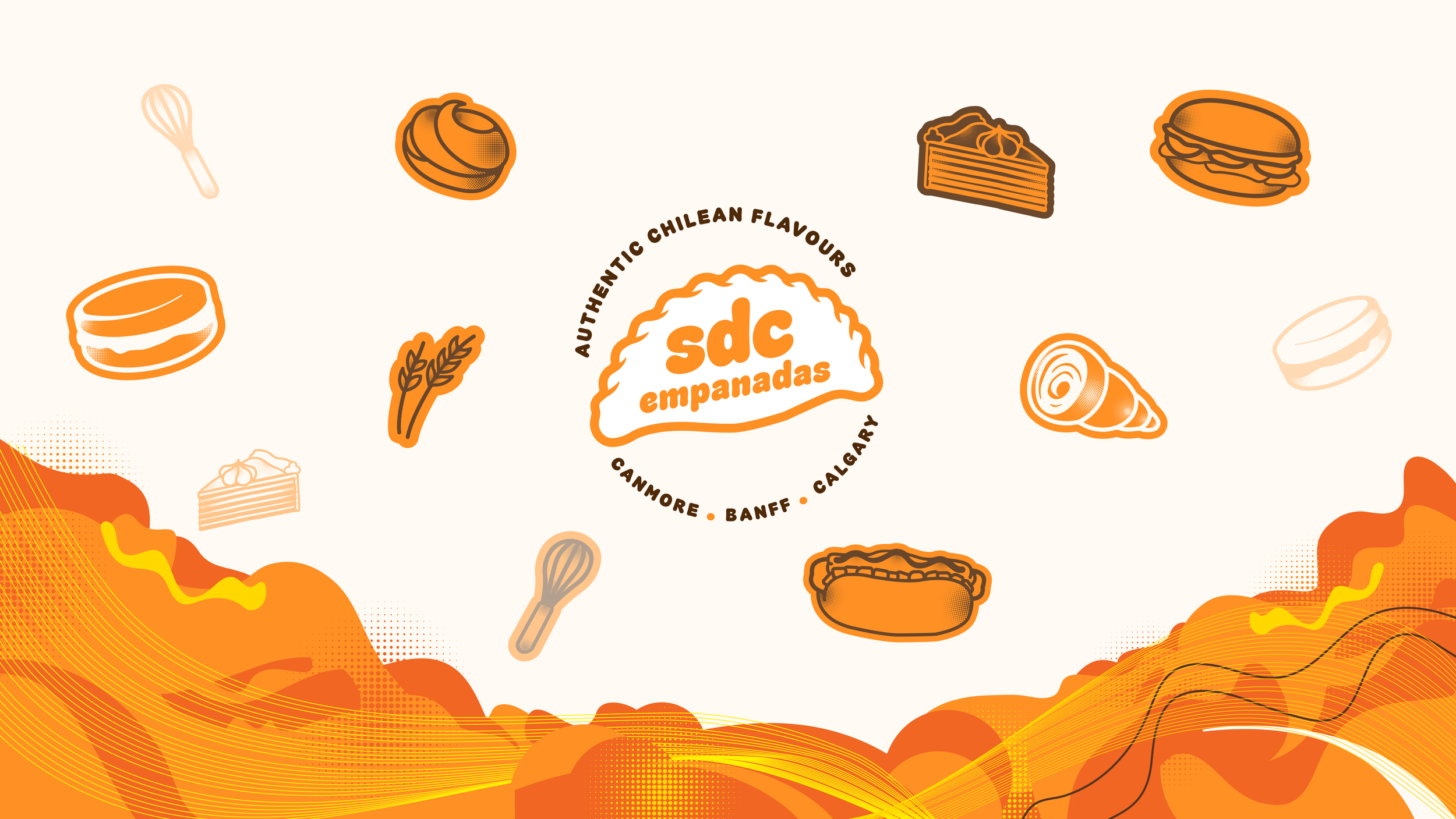
The graphic elements were developed as a flexible toolkit rather than isolated assets, allowing SDC to combine typography, colour, imagery, and illustration differently depending on the application while still feeling unmistakably like the same brand.
Typography
Bold enough to be noticed.
Typography plays a central role in the identity, giving headlines, menus, promotional pieces, and social content a strong visual voice even when imagery isn't present.
Colour
Warm, energetic, recognizable.
Colour differentiates products within the range while maintaining a clear relationship to the master brand.
The palette supports fast identification between flavours and creates a consistent structure across multiple SKUs.
Illustration
A little character goes a long way.
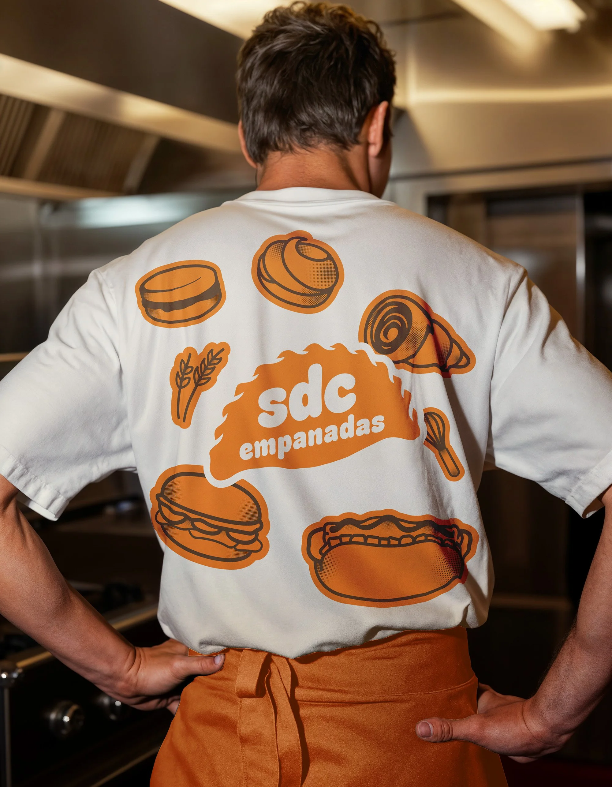
Illustration adds warmth and personality to the system, giving SDC a recognizable visual language that can move between communications, merchandise, signage, campaigns, and digital content.
Brand System.
Built to move.
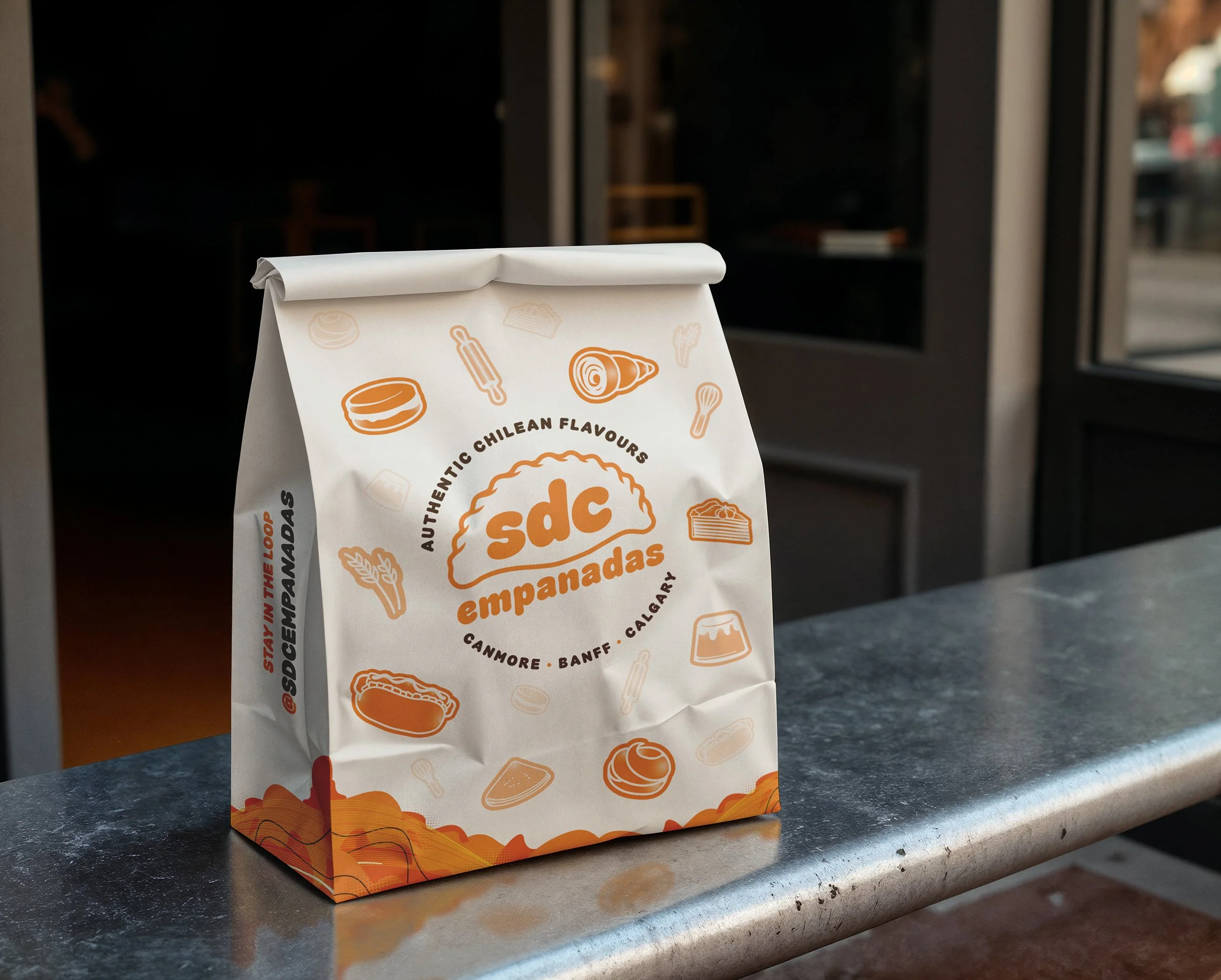
SDC needed an identity capable of moving between digital content, printed materials, menus, event environments, promotional pieces, and everyday communications without becoming repetitive.
Rather than creating one fixed composition, we developed a set of visual ingredients that can be combined and adapted while keeping the brand consistent.
This gives SDC enough structure to remain recognizable — and enough freedom to stay fresh
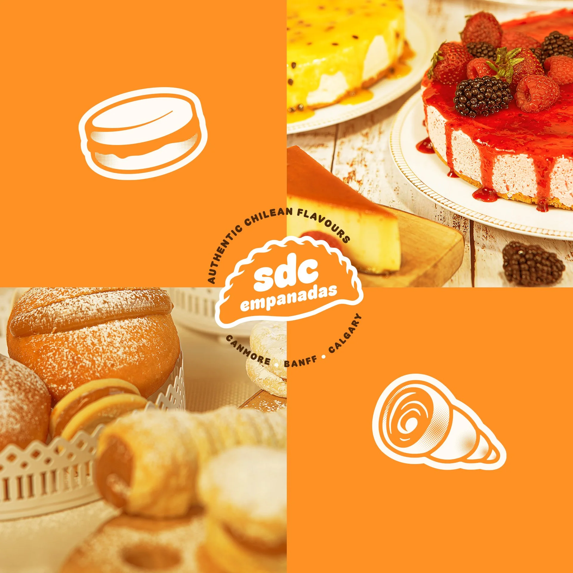
Sweet Pastries
Creamy & Powdered
Baked goods
Original seasonings
Fried & Crispy
Dulce de Leche
Butter
In the Real World.
Made for wherever the food goes.
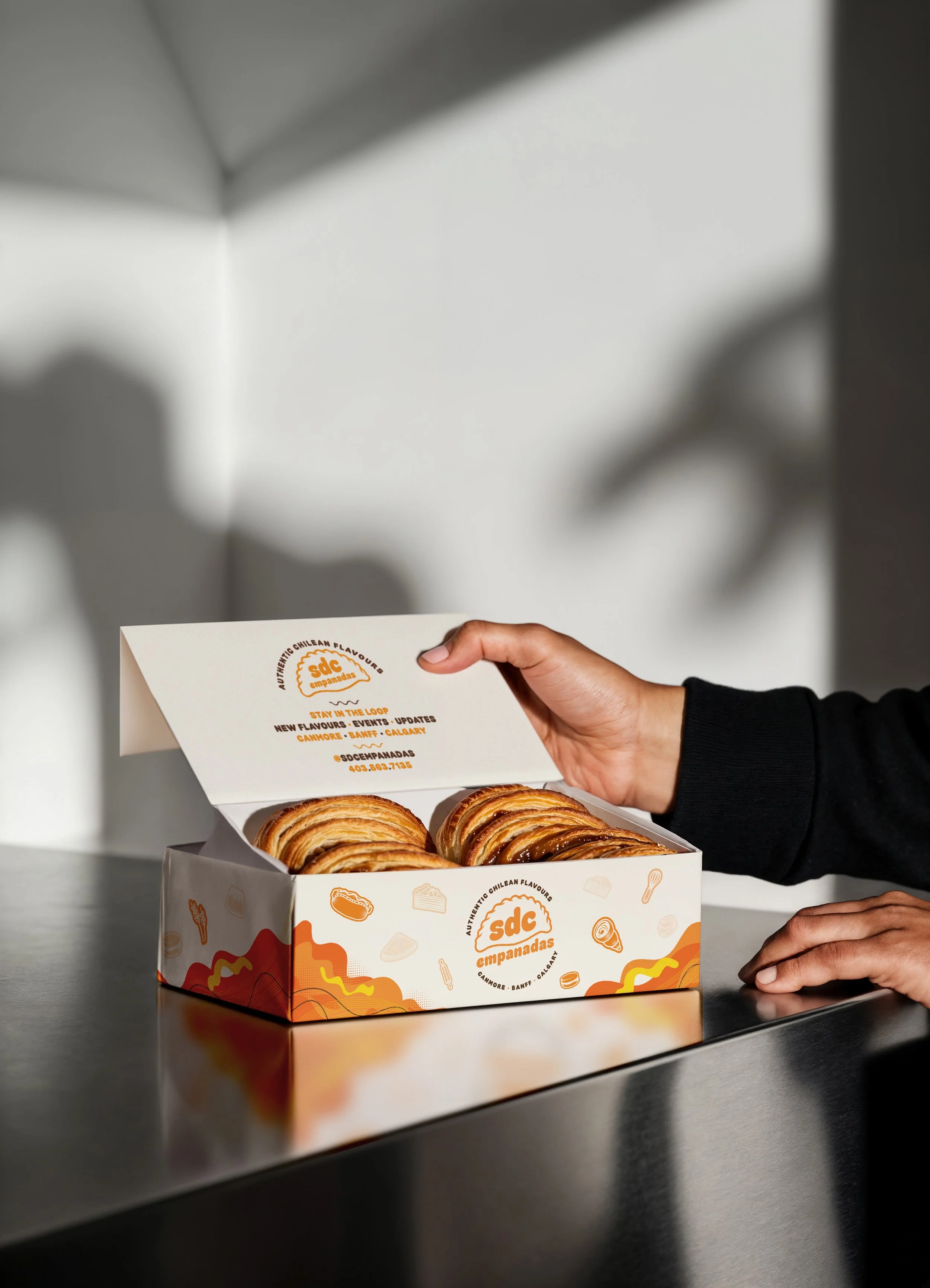
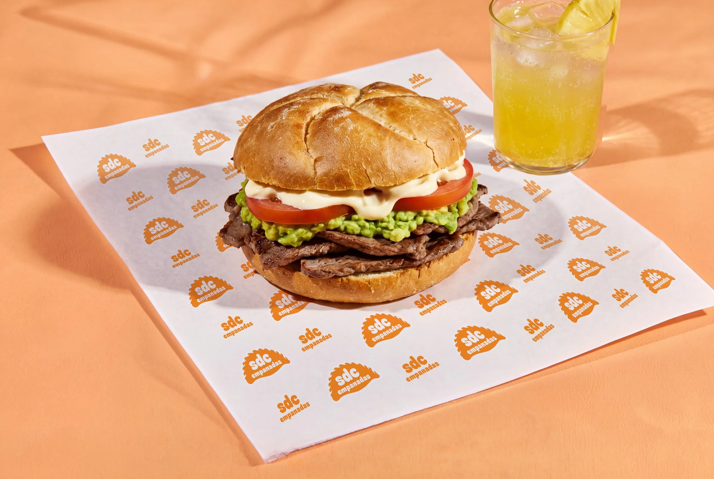
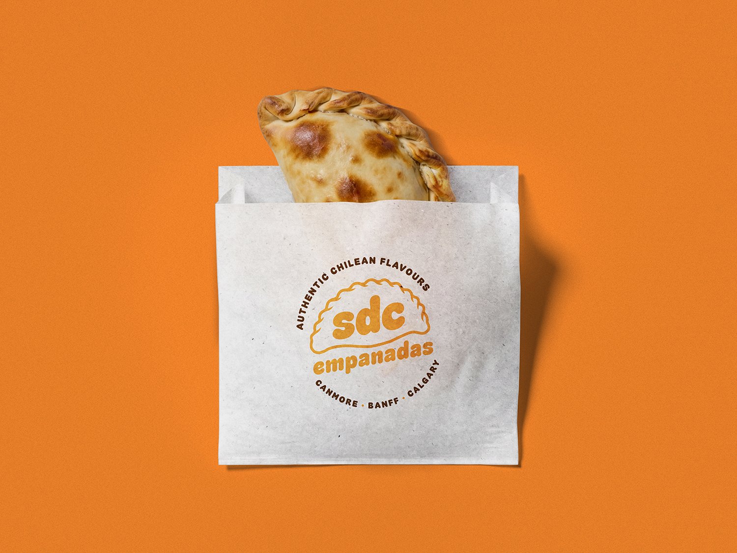
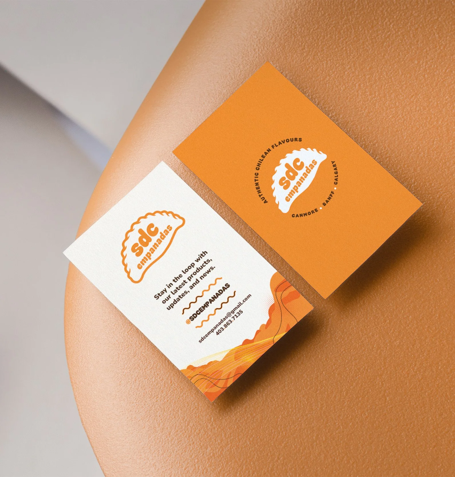
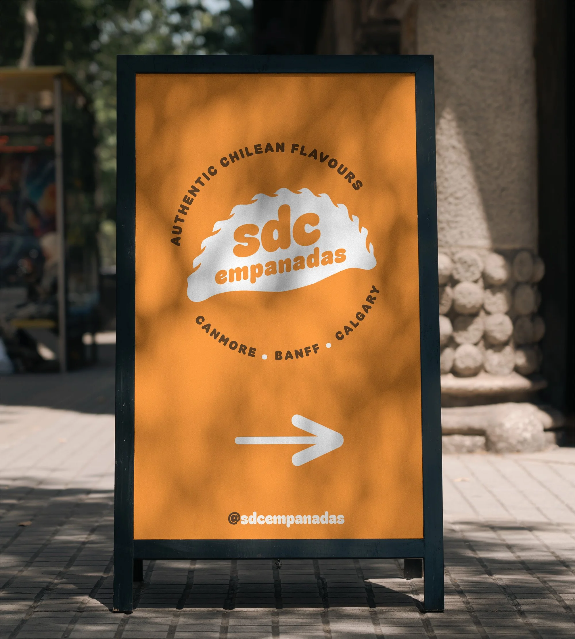
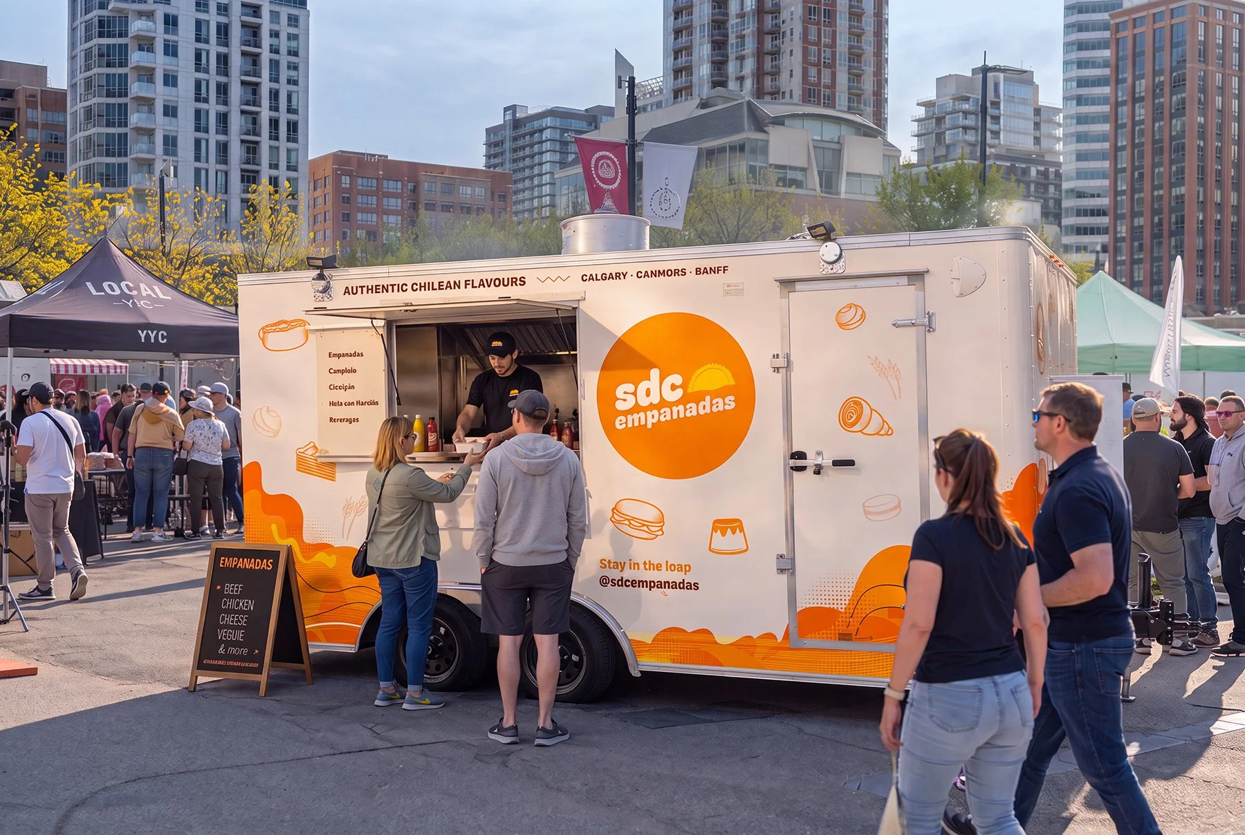
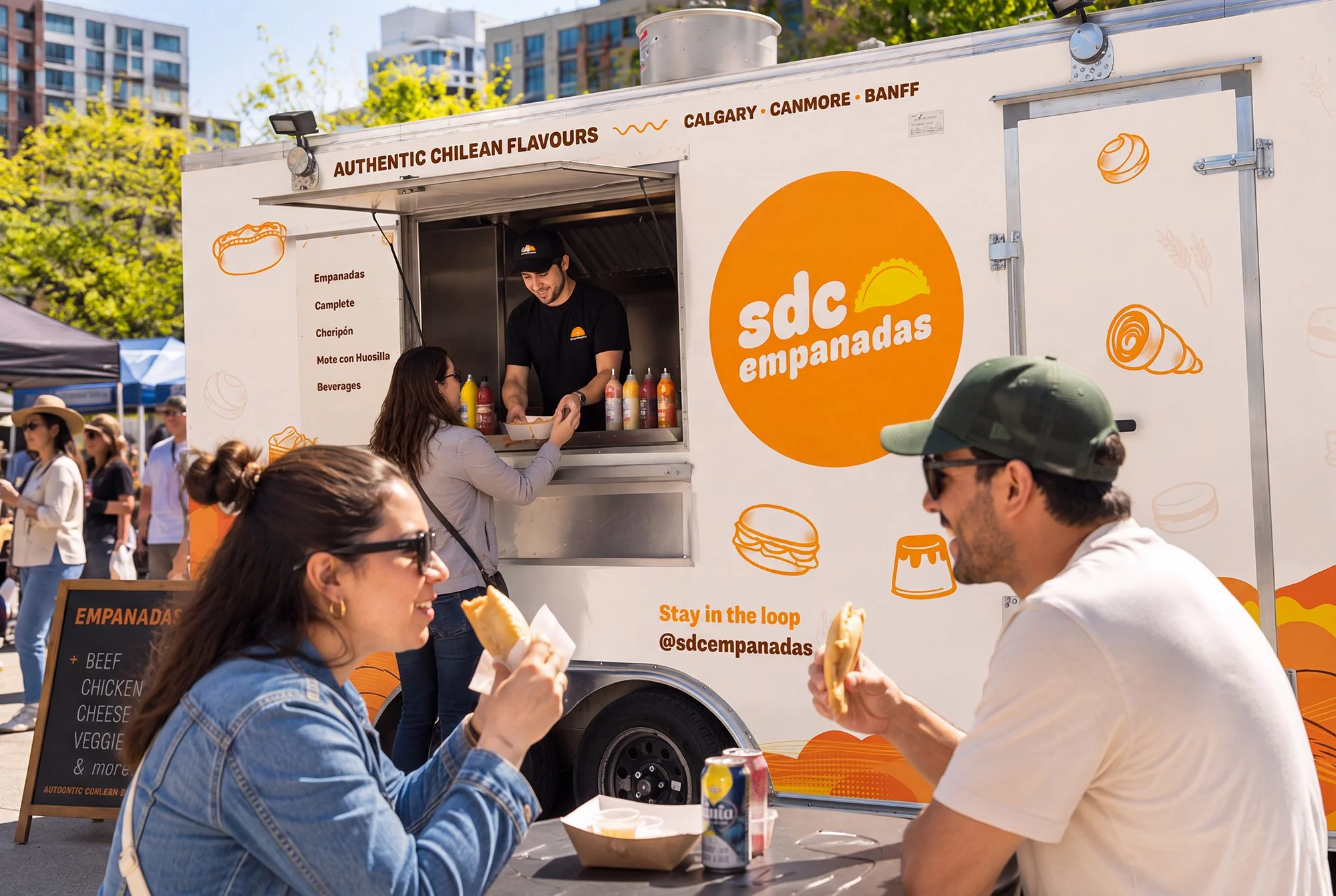
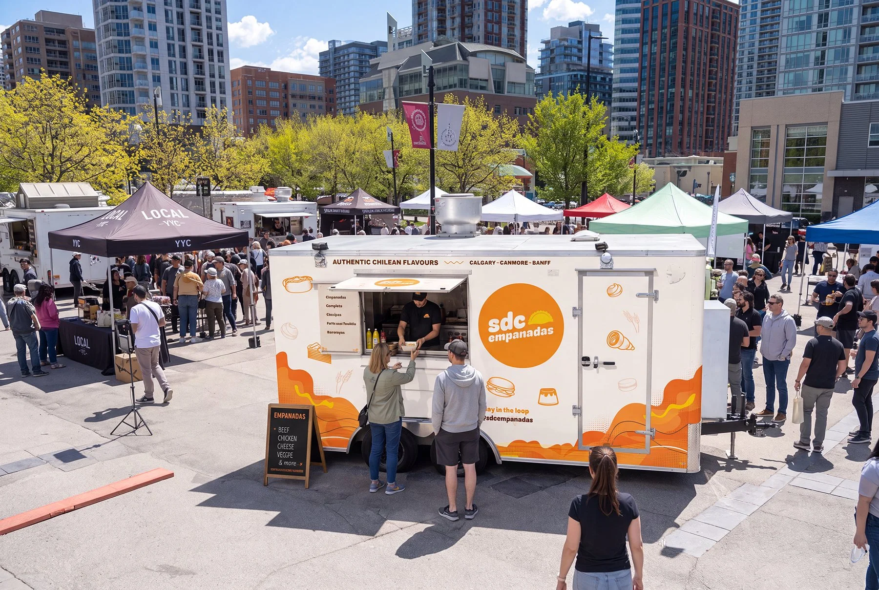
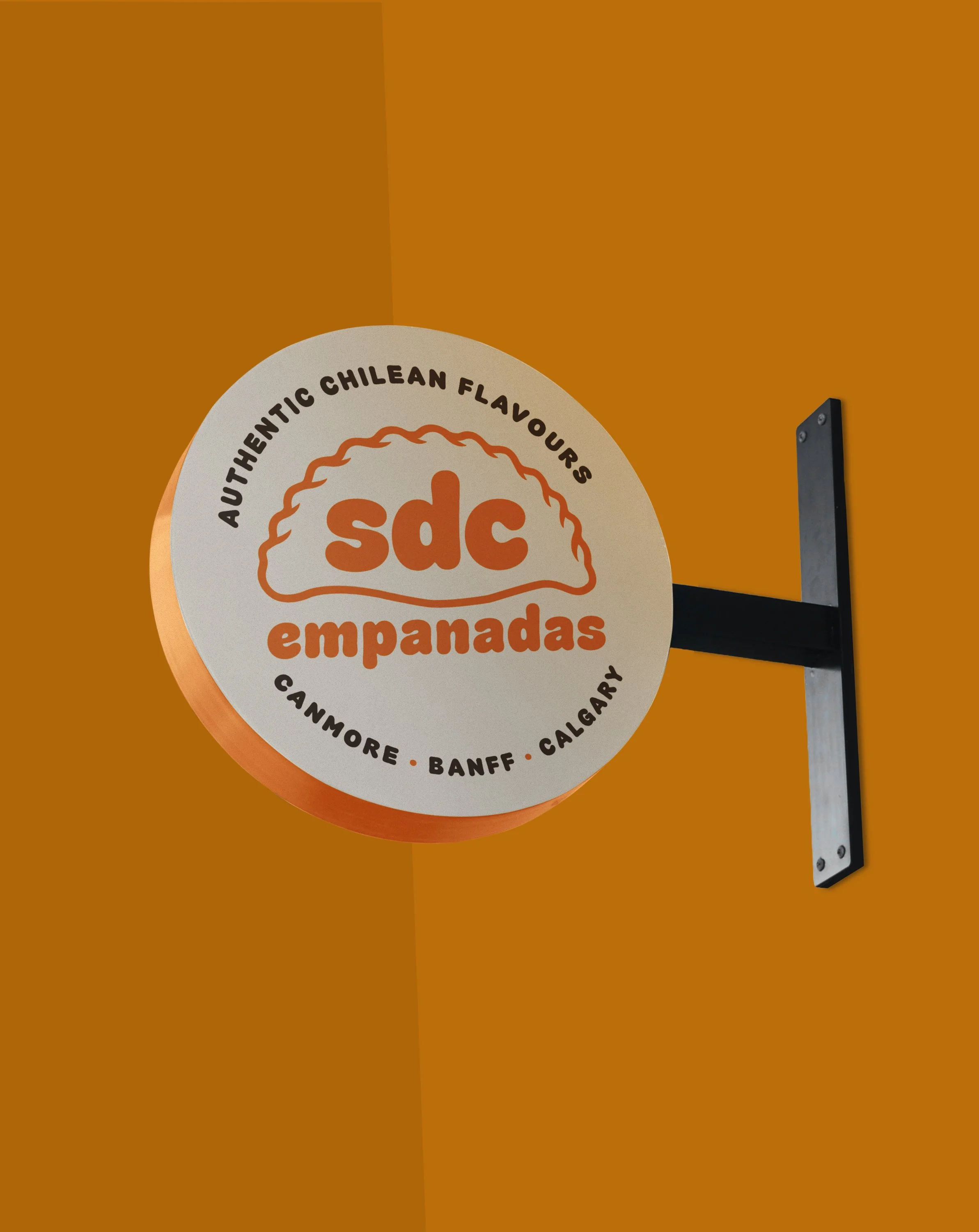
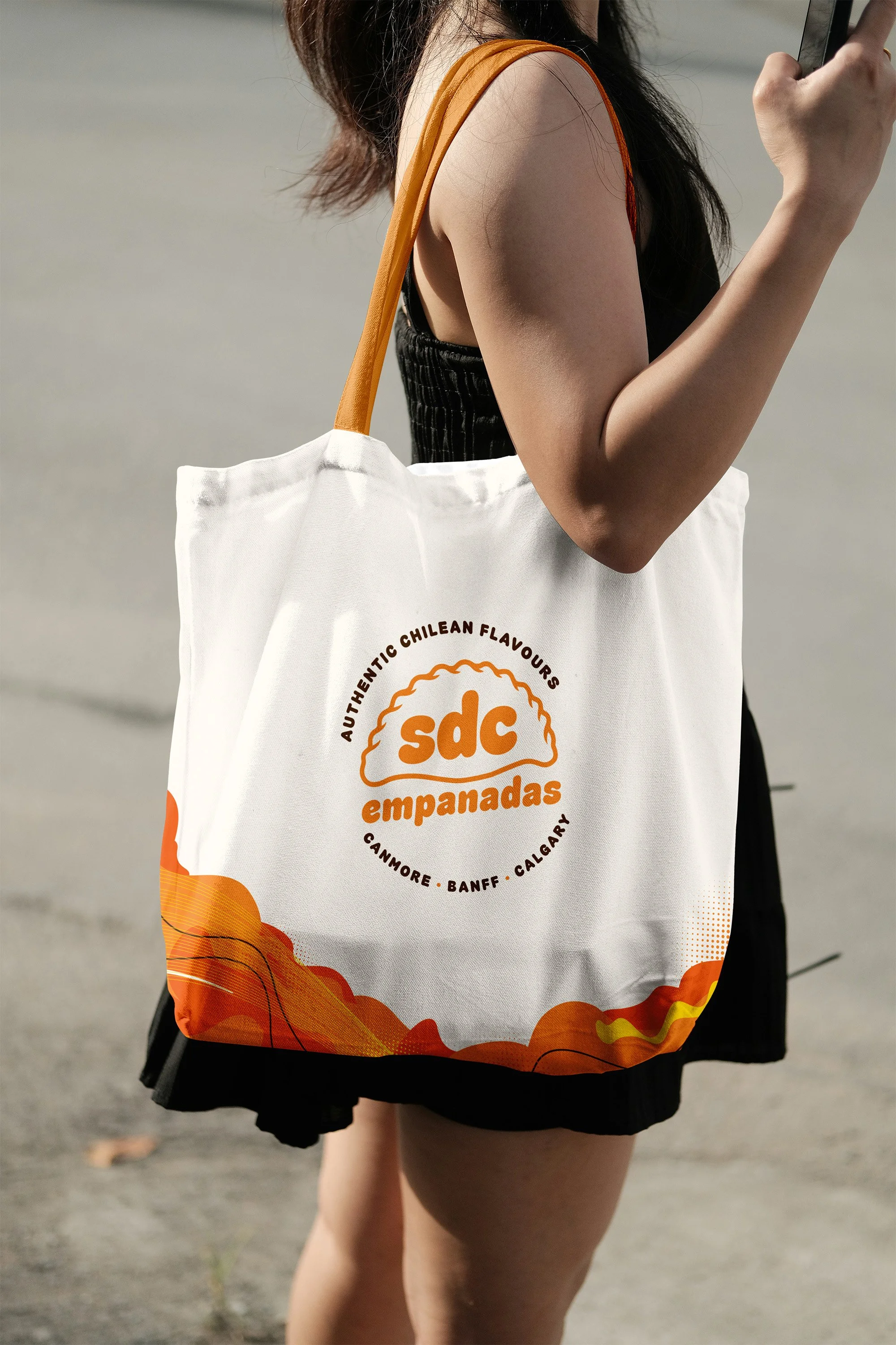
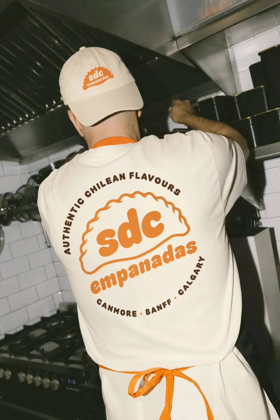
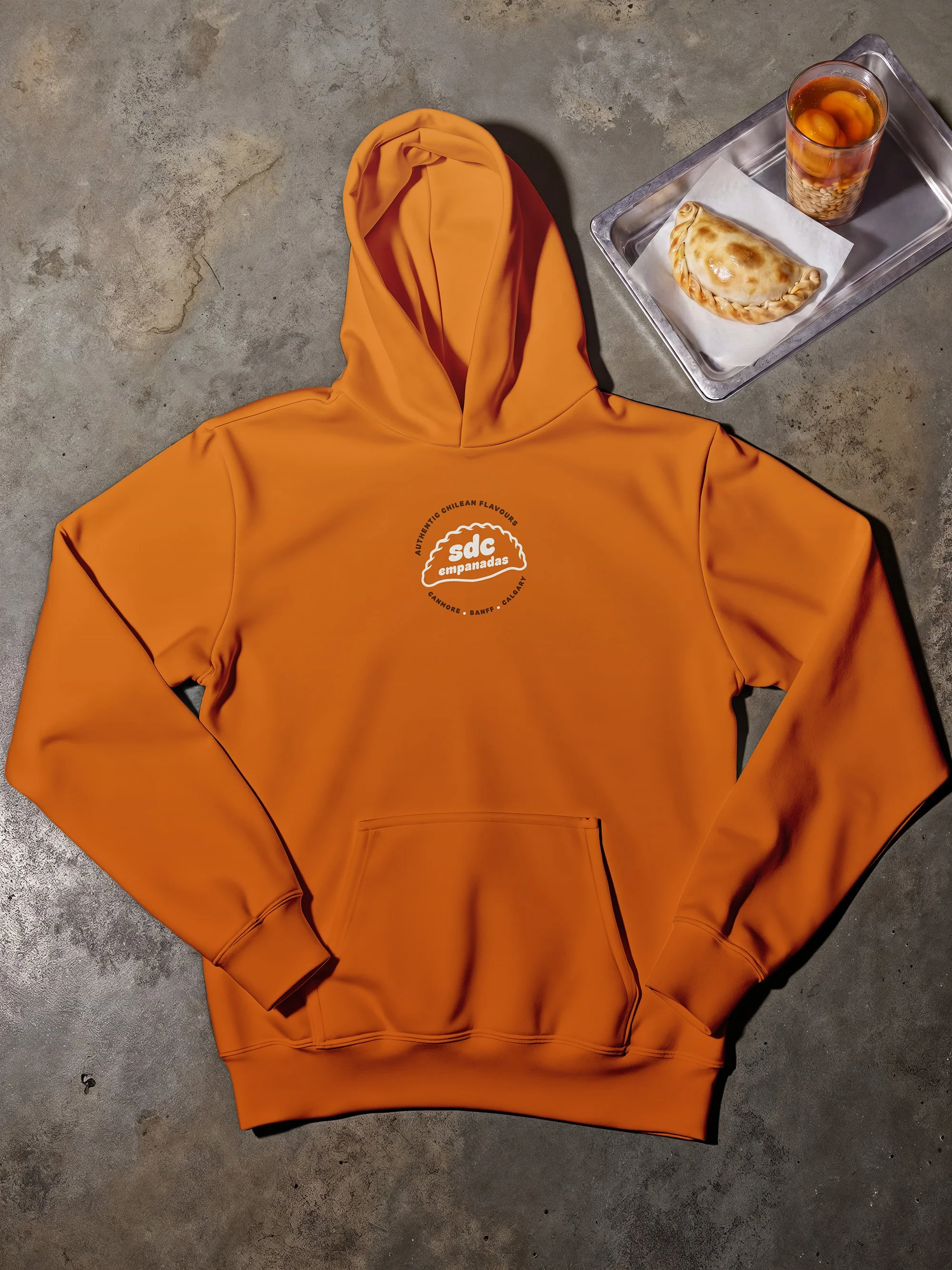
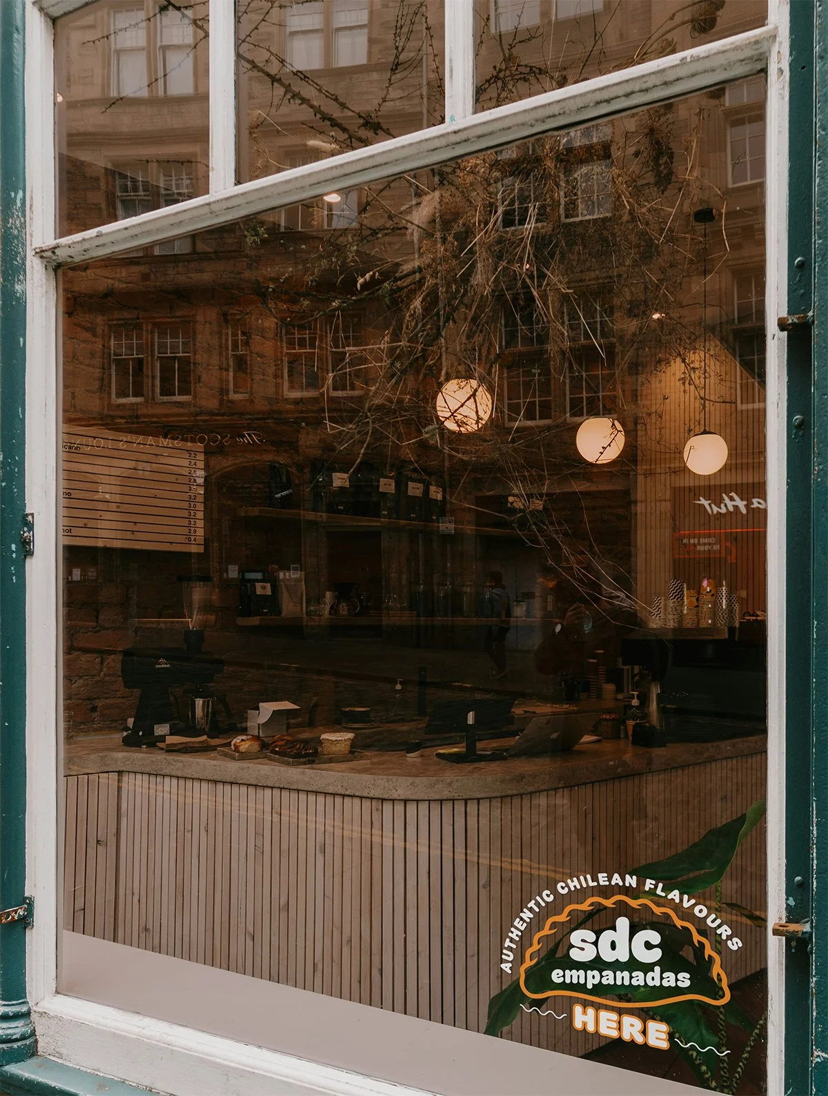
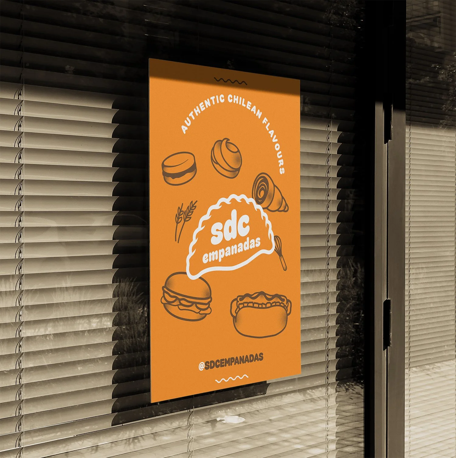
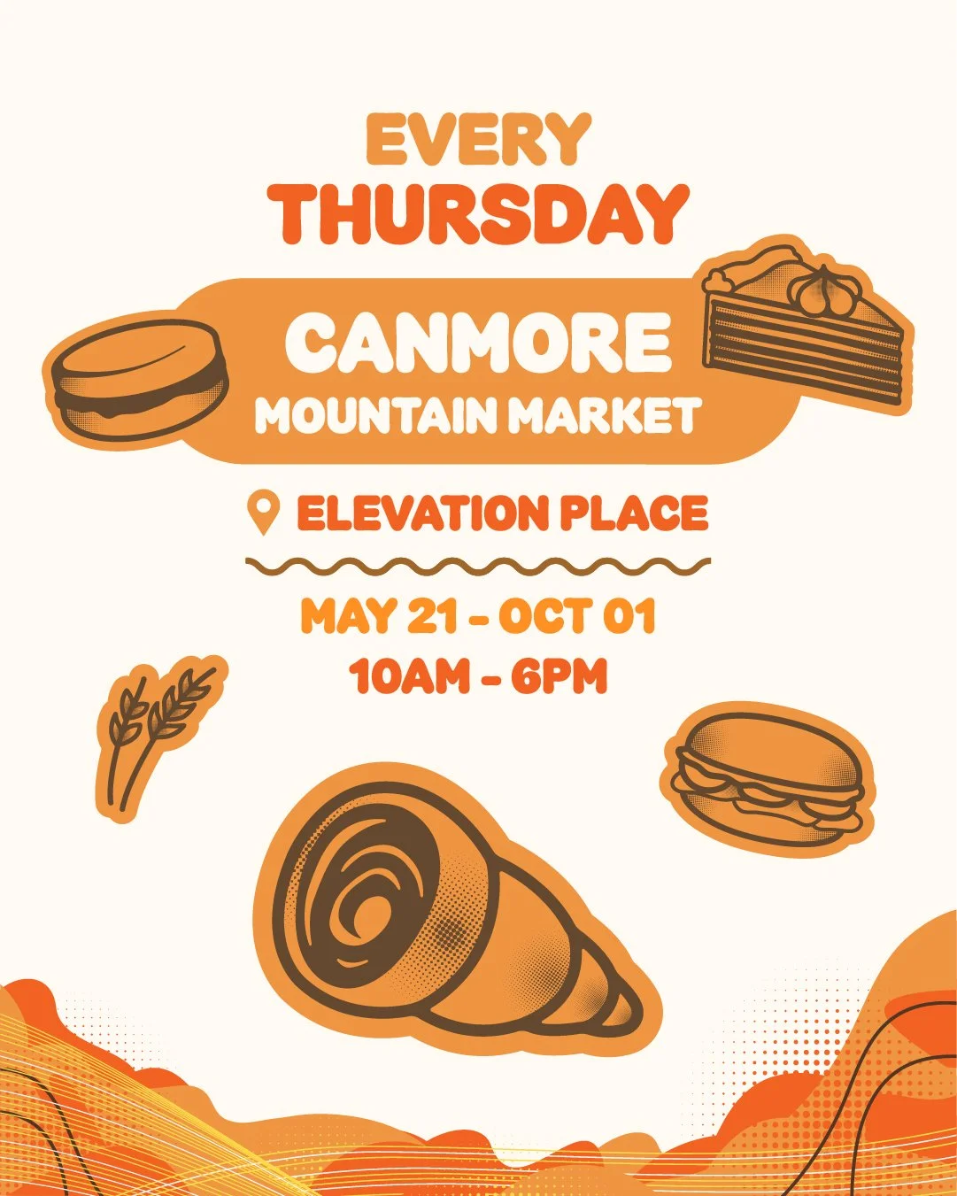
The identity was applied across the touchpoints SDC uses to meet people — from digital communication and promotional materials to markets and physical brand experiences.
The goal was always the same: make the brand easy to recognize and enjoyable to interact with, wherever someone encounters it.
Applications
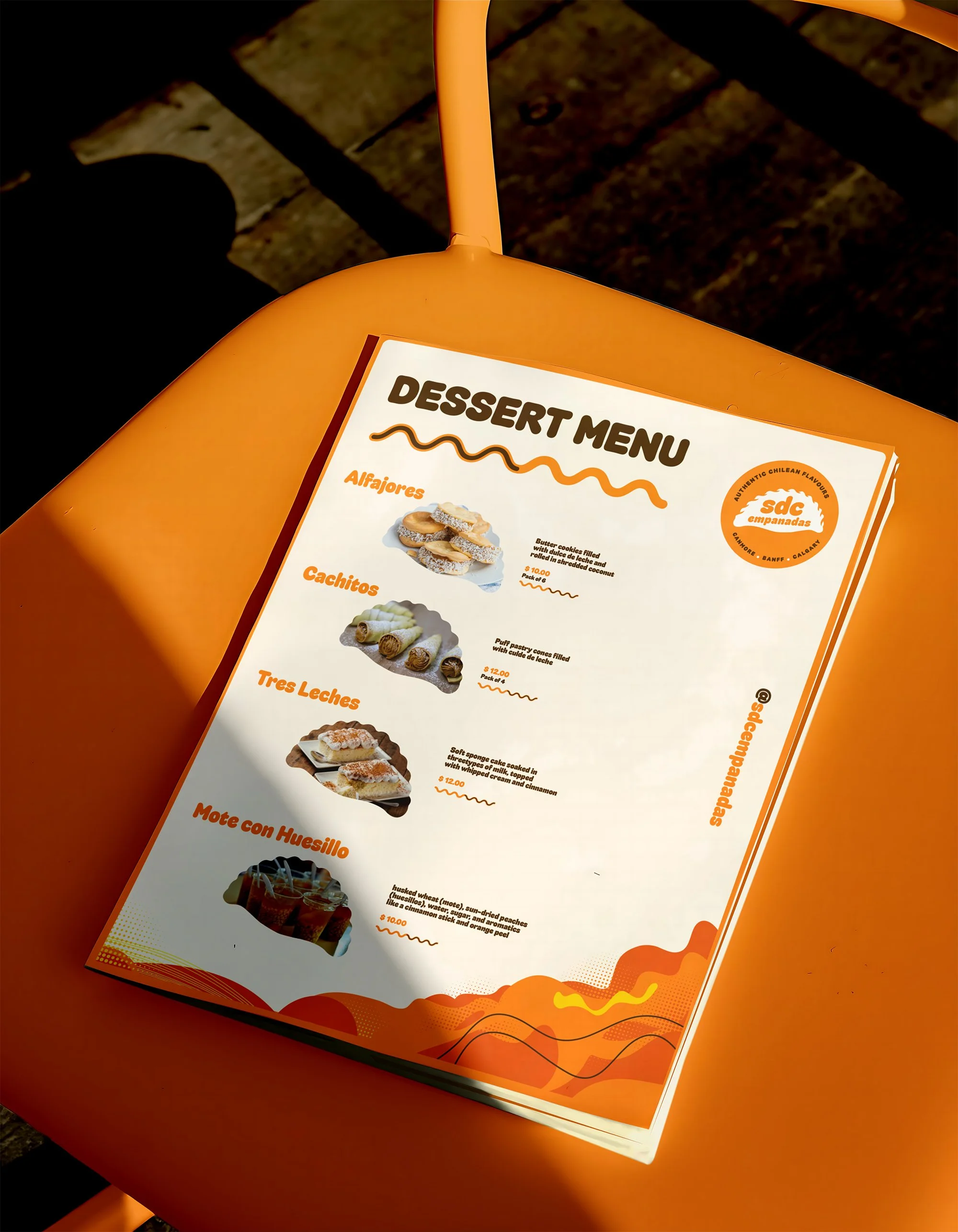
Menus
Clear information hierarchy without losing the personality of the brand.
Social & Digital
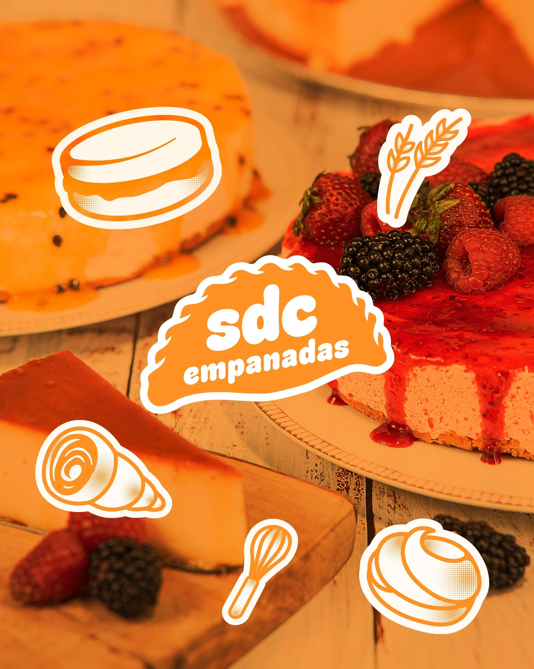
A flexible content system designed to make everyday communication feel consistent without every post looking identical.
Events & Markets
Graphic elements that can work quickly and clearly in environments where customers are seeing multiple vendors at once.
Promotional Materials
Campaign and print applications that extend the visual language beyond the core identity.

Social / Digital
A brand designed to keep talking.
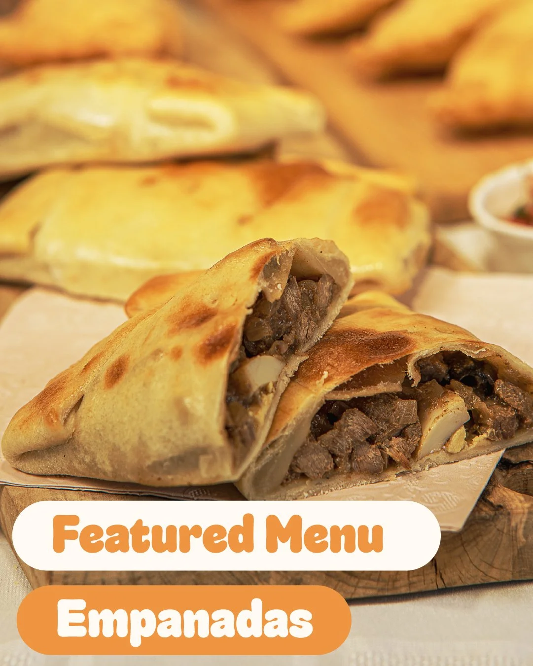
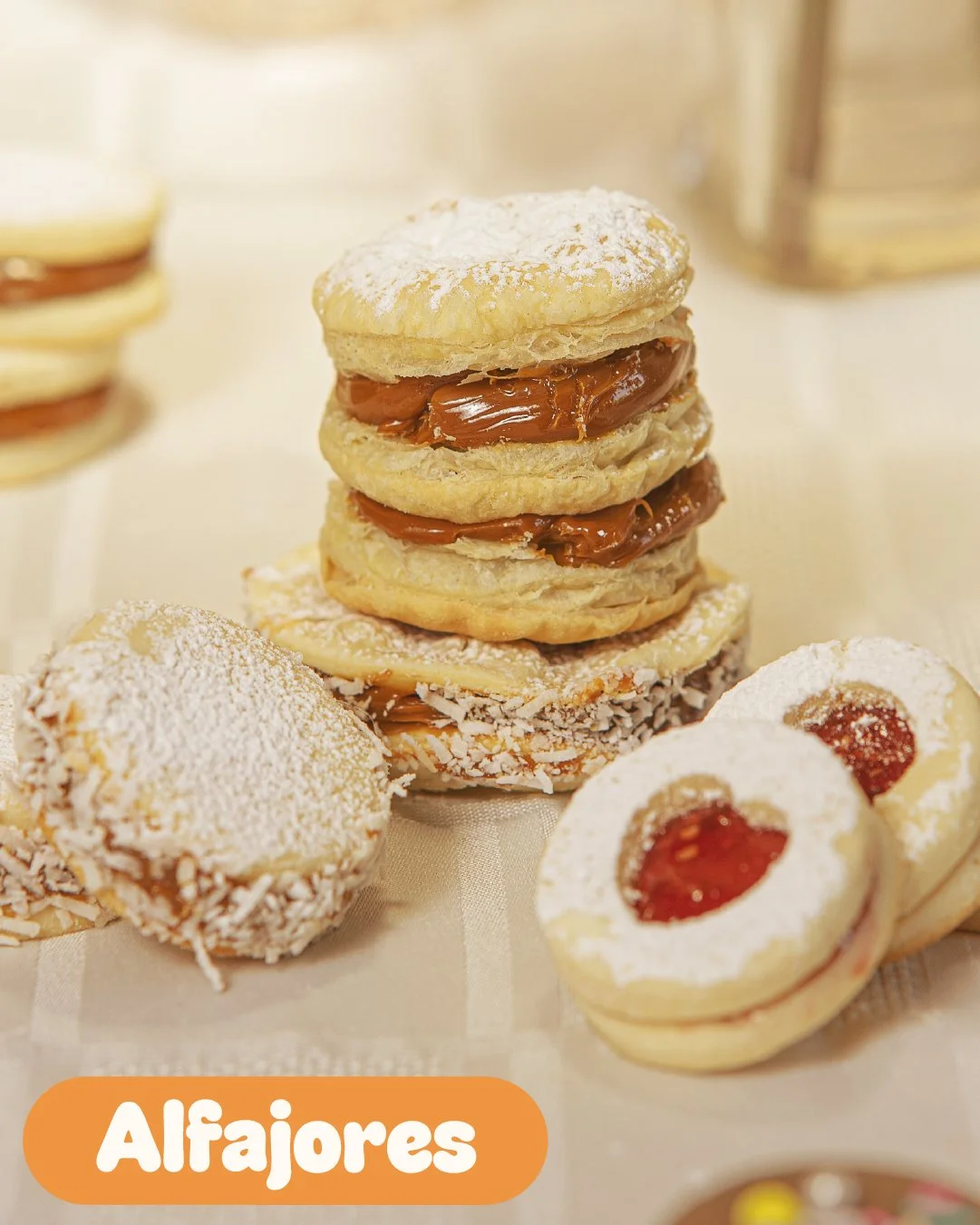
We developed digital assets and a flexible visual hierarchy that allow SDC to communicate new menu items, locations, events, and everyday content while maintaining a recognizable brand presence.
The system gives the business a repeatable foundation for creating content without requiring every communication piece to be designed from scratch.

outcome.
One identity, many places to show up.
The finished system gives SDC a recognizable visual language that can grow alongside the business.
From a food-truck appearance to a market sign or Instagram post, the brand has enough consistency to be recognized and enough flexibility to adapt.
Most importantly, the identity gives the personality behind the food a way to come through before someone has even taken their first bite.
Let’s make something worth building.
Whether you’re starting something new, evolving an existing brand, or looking for a clearer way to bring your ideas together, tell us what you’re working on and where you’d like to take it.
Next Project